Answered

My form is not displaying correctly on mobile

  • 15 August 2022
  • 6 replies
  • 630 views

Hi there, 

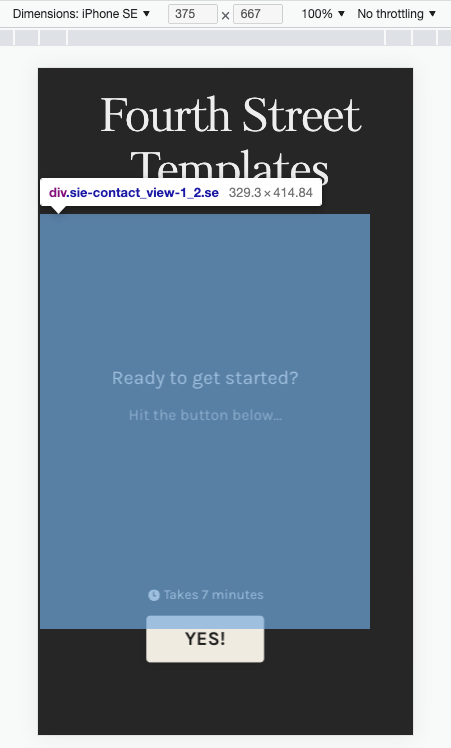
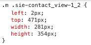
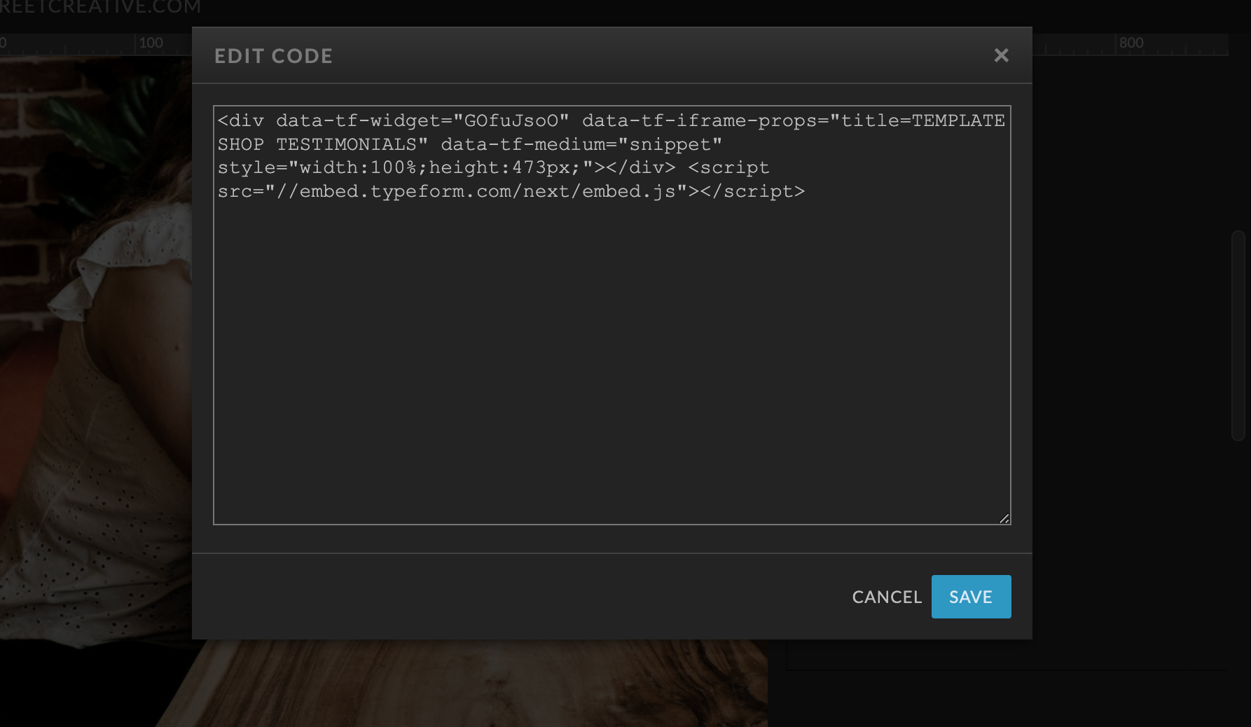
I just published a form on my Showit site and when I look at it on my phone the form is cut off like it’s not responsive I thought these forms worked on mobile devices? Any suggestions? 

Here is the url: https://fourthstreetcreative.com/templatewins


Thank you! 

icon

Best answer by mathio 23 August 2022, 12:06

View original

6 replies

Userlevel 7
Badge +5

Hi @melbuggy Happy Monday! Thanks for stopping by the community. Our forms are responsive on mobile, but I think with your site, the issue has to do with how the form is embedded on your website. @mathio may have a more specific answer, but are you embedding your form into a section/frame on your site? (Or do you mind sending a screenshot of where/how you’re adding the code?)

Here it is! I’m guessing it’s missing some mobile responsive code? 

Any ideas?

Userlevel 7
Badge +5

Hello @melbuggy 

I have looked at your website and I see your typeform is not resized to 100% of the screen width. Is this the issue you are referring to?

I see the form is placed in a DIV element (highlighted below) that is not resized to 100%. The typeform embedded is resized to 100% of the parent element (the DIV).

However the DIV is not resized properly.

You need to ensure that the parent DIV is resized correctly (to 100% of the screen width).

Thank you! I changed the height to 100% as well and that seemed to fix the issue thanks!

Userlevel 7
Badge +5

Wahoo! Glad to hear that worked, @melbuggy ! Let us know if you need help with anything else. 😀

Reply