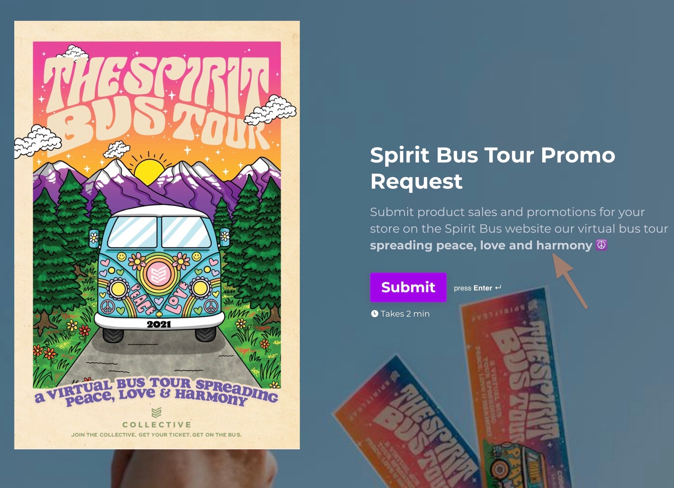
How can I increase the opacity on the Welcome Screen description? It’s not 100% and it’s a bit tough to see with the image I want to use for a form. 

Hi @spiritleafforms thanks for stopping by! We don’t currently have an opacity setting on the welcome screen, but would you mind sending a screenshot of the issue? I can take a peek to see if there are any suggestions I can make regarding the image. Thanks!


Hey Liz, here’s a screenshot. It’s the description under the text. It’s supposed to be white but Typeform has the opacity at rgba(255, 255, 255, 0.7) by default. I already have a dark overlay over the image to try and make it more visible.


Hi @spiritleafforms Ah, I see - thanks! (Also, this bus tour looks fun!) Is it the text of the description that’s causing some of the issues? I see the text is a bit grayer than the title text above. Or would you prefer the image be even brighter instead of the overlay? 


Hi @Liz – yes the gray text with the arrow pointing is the issue, it’s set to white to match the heading, but has less opacity by default. Not sure how to change.


Hi @spiritleafforms got it - thanks! This is changed automatically, which I can see is a bit frustrating. I’ll share this feedback with our product team, but if you think of any other questions or feedback, please let us know. 


Reply