Can we have separate images for desktop and mobile background? | Community
Skip to main content
Answered

Can we have separate images for desktop and mobile background?


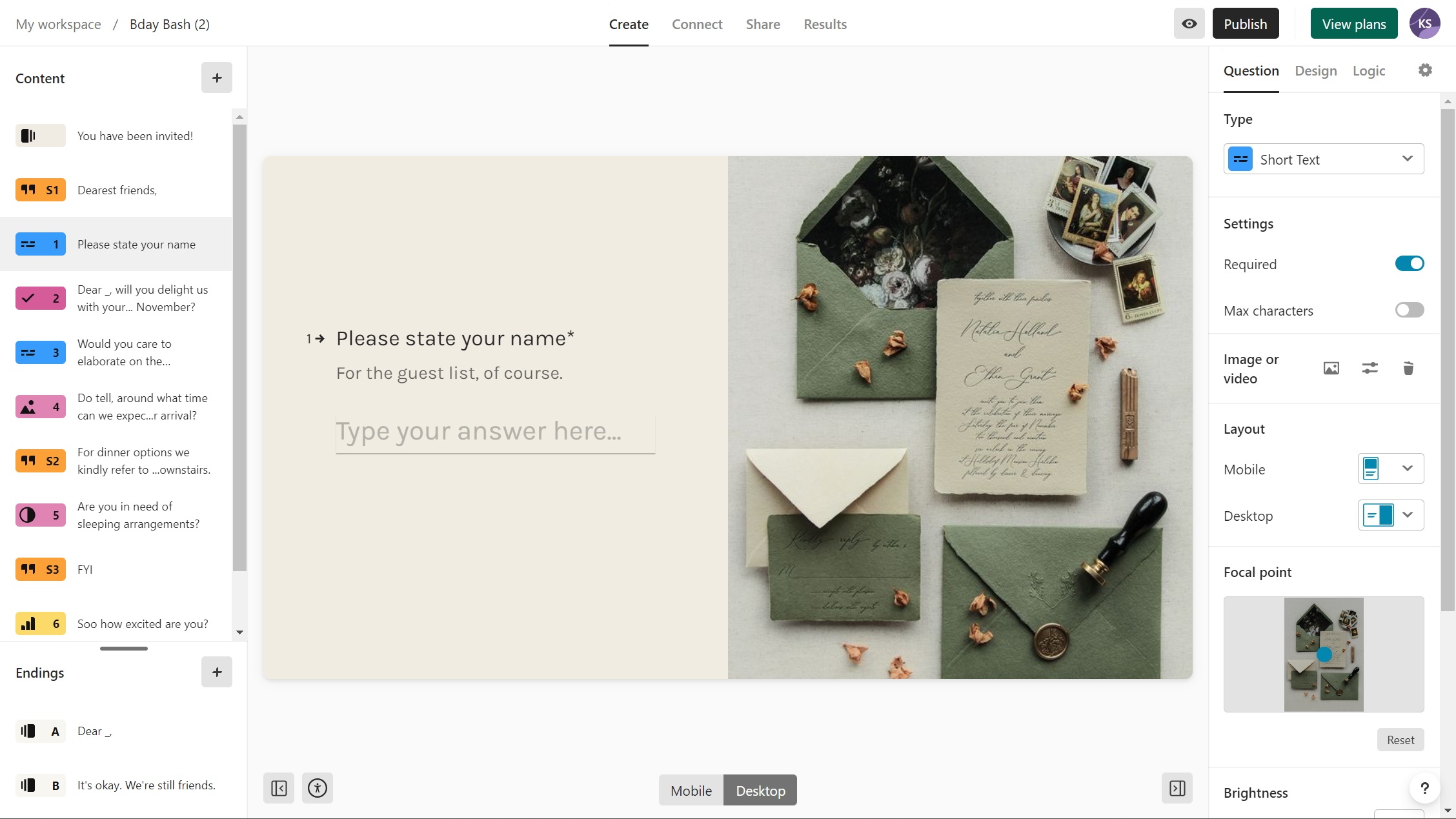
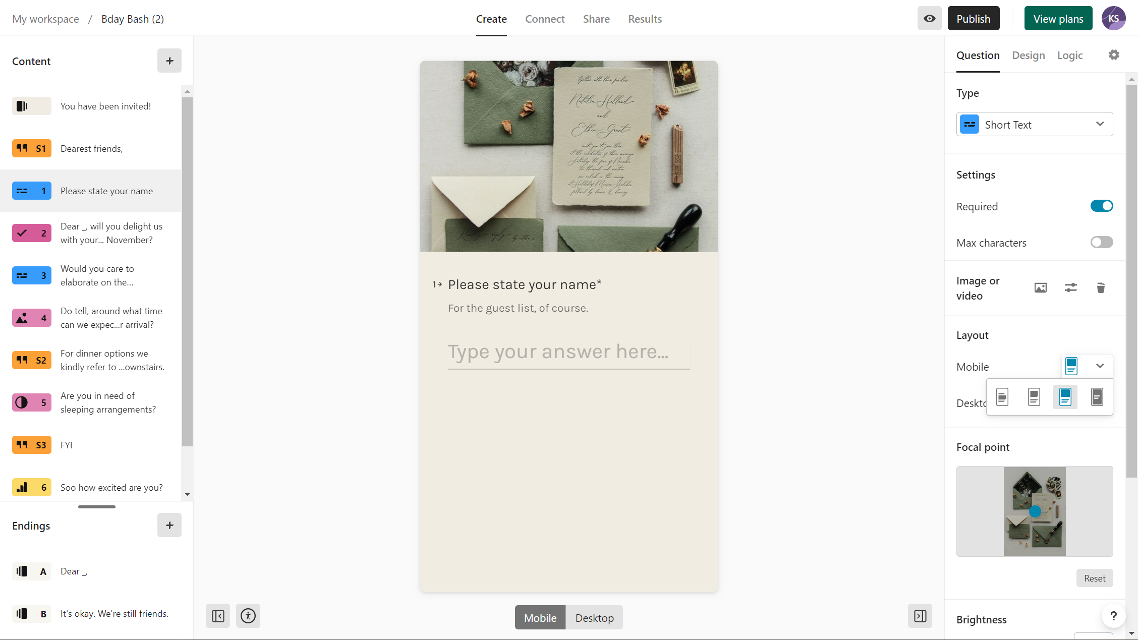
The imagery we have used for our typeform background is mainly focued around the top right hand corner. It looks great on desktop, however on mobile once typeform has cropped the image, nothing can be seen as the imagery in the corner has been cropped out.


Is there any way to have a different mobile sized image for mobile viewers?

Best answer by Mariana

Hey @McCorkell_M. Welcome to the Typeform Community :hugging:


This isn't an option at the moment but I agree that would be an amazing feature! For some extra visibility, you might want to post your suggestion here as well:


Please keep the feedback coming. =)

View original

8 replies

Mariana
Ex–Typefomer
Forum|alt.badge.img+5
  • Ex–Typefomer
  • 679 replies
  • Answer
  • April 28, 2021

Hey @McCorkell_M. Welcome to the Typeform Community :hugging:


This isn't an option at the moment but I agree that would be an amazing feature! For some extra visibility, you might want to post your suggestion here as well:


Please keep the feedback coming. =)


Please add this functionality. It’s so needed. Have your development team think about website development. On virtually any modern platform, SquareSpace for example, you are able to create a separate layout for mobile vs desktop, as image cropping and text ALWAYS need to be adapted and optimized on desktop and mobile independently to optimize the experience. Your platform is great for surveys and our company is moving to use it exclusively, but this basic functionality is an absolute MUST. Especially considering people that are strong designers and want to leverage imagery and layout to create really well-designed, custom survey experiences for their audience. It’s impossible to do this with a horizontal (desktop) layout that is exactly the same and inextricably linked to a narrow, vertical layout (mobile). Not being able to create separate layouts for mobile and desktop with the same survey strongly compromises the power of your platform as both experiences end up being much, much more generic.


  • Navigating the Land
  • 3 replies
  • August 3, 2022

I join the choir of “Pleeez!” here!

We’re building quiz games where the whole of the visual is important to the user experience, but vertical presentation cuts the sides of the image in the background, removing important visual aspects of it


We created specific background images both to horizontal and vertical version of the quiz, adapting the images to each interaction mode, but so far the only option is to duplicate the  typeform and have links to each other.

This is a pain to keep up to date, because every change has to be done separately in each typeform.

So please, pretty pleeease, I’m sure that would be a huge gain to the user experience - both to the builder and to the respondent! 


  • Navigating the Land
  • 2 replies
  • October 11, 2022

Adding another vote for this! The end cards look great on desktop but pretty terrible on mobile as the images are cut off very oddly.


  • Navigating the Land
  • 2 replies
  • December 7, 2022

I was just about to ask the same thing. Keep upvoting on this. This is a much needed feature!


  • Navigating the Land
  • 1 reply
  • September 30, 2023

I actually have this exact feature in my account (see below for the way its displayed), but I noticed that a friend of mine doesn’t. Is it perhaps in a testing phase or something? Would your product division have an estimate on when to expect this feature to go live, if everything works out well?

* A broad estimate is also fine, since I understand it might be difficult to pinpoint yet.


Desktop view
Mobile view


Forum|alt.badge.img+1
  • Explorer
  • 10 replies
  • October 11, 2023

@KMess I would love to find out where that feature is! I don’t see it on my end either. 


Adding another vote to this feature request!


Reply