First time poster, apologies if I stumble or this has been answered previously…
Am creating a 25 question quiz, multiple choice. Right now, regardless of what answer the user chooses in the quiz, the selected answer always has a tick next to it (which makes it seem like they got it correct). Is it possible to have an X or Tick based on their answers??
If they get it wrong, show an X on the answer bar/area. If they got it right, keep the tick. The next screen I have has the right answer/description. But I feel the tick on all answers, regardless, on the question page is confusing…
Thanks in advance.
Lincoln
Best answer by john.desborough
lincolneather wrote:
Hi John,
Thanks for the input. I understand it’s just showing that i have that option selected, but it does give off ‘it’s correct’ feeling. Alot of people I’ve tested this with have that opinion, that they thought they got the answer correct..
It doesn’t seem like there’s any flexibility in changing it from a tick to anything else, which is a shame. But still workable..
Thanks guys
I hear you. Though for the use cases in my domain, the users that tested my UI came back with the fact that they liked the tick box, because it was easy to see which ones they had selected. Now, in my case(s), there is no right or wrong answer, just perceptions - most of mine are related to maturity assessments. in cases where i have done quizzes, i have used the description field to remind folks that i will show them the results of the test (ie # correct vs incorrect) at the end of the quiz. That way they are seeing where the expectations of how well they did will be answered.
I agree with you that the use case will drive the desire to show something else and i am certain that this will find its way on to the Product team ‘wish list’ and will be addressed as soon as it surfaces to the top of the list.
Hi @lincolneather welcome to the community! :) Happy to have you here, and happy you’re posting! Would you mind sending a screenshot or video of the issue along with the form URL? That will help me better see what’s happening so I can be sure I’m providing the right solution.
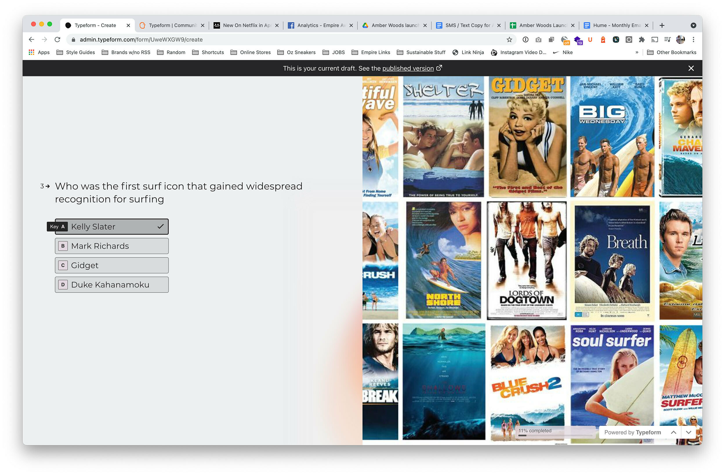
I’ve attached a screenshot of the quiz with the ‘tick’ next to the incorrect answer. I’d love to have a ‘x’ next to incorrect and a tick next to correct. Is that possible?
@lincolneather - this is from another user - that just shows that you have selected that option. it is not a validation of the correct or incorrect answer - you would need to progress to the next page/question in order to display whether it was a correct or incorrect answer, using the native functionality. You would also have to use the logic functions to determine if the answer selected met your correct or incorrect condition.
Thanks for the input. I understand it’s just showing that i have that option selected, but it does give off ‘it’s correct’ feeling. Alot of people I’ve tested this with have that opinion, that they thought they got the answer correct..
It doesn’t seem like there’s any flexibility in changing it from a tick to anything else, which is a shame. But still workable..
Thanks guys
I hear you. Though for the use cases in my domain, the users that tested my UI came back with the fact that they liked the tick box, because it was easy to see which ones they had selected. Now, in my case(s), there is no right or wrong answer, just perceptions - most of mine are related to maturity assessments. in cases where i have done quizzes, i have used the description field to remind folks that i will show them the results of the test (ie # correct vs incorrect) at the end of the quiz. That way they are seeing where the expectations of how well they did will be answered.
I agree with you that the use case will drive the desire to show something else and i am certain that this will find its way on to the Product team ‘wish list’ and will be addressed as soon as it surfaces to the top of the list.
I’ve ran the idea you shared past a few people who are testing for me, and they’ve said it makes it easier to understand but it’s still a little confusing. It’s a good enough work around for the moment, so i can get it up and running and iterate from there.