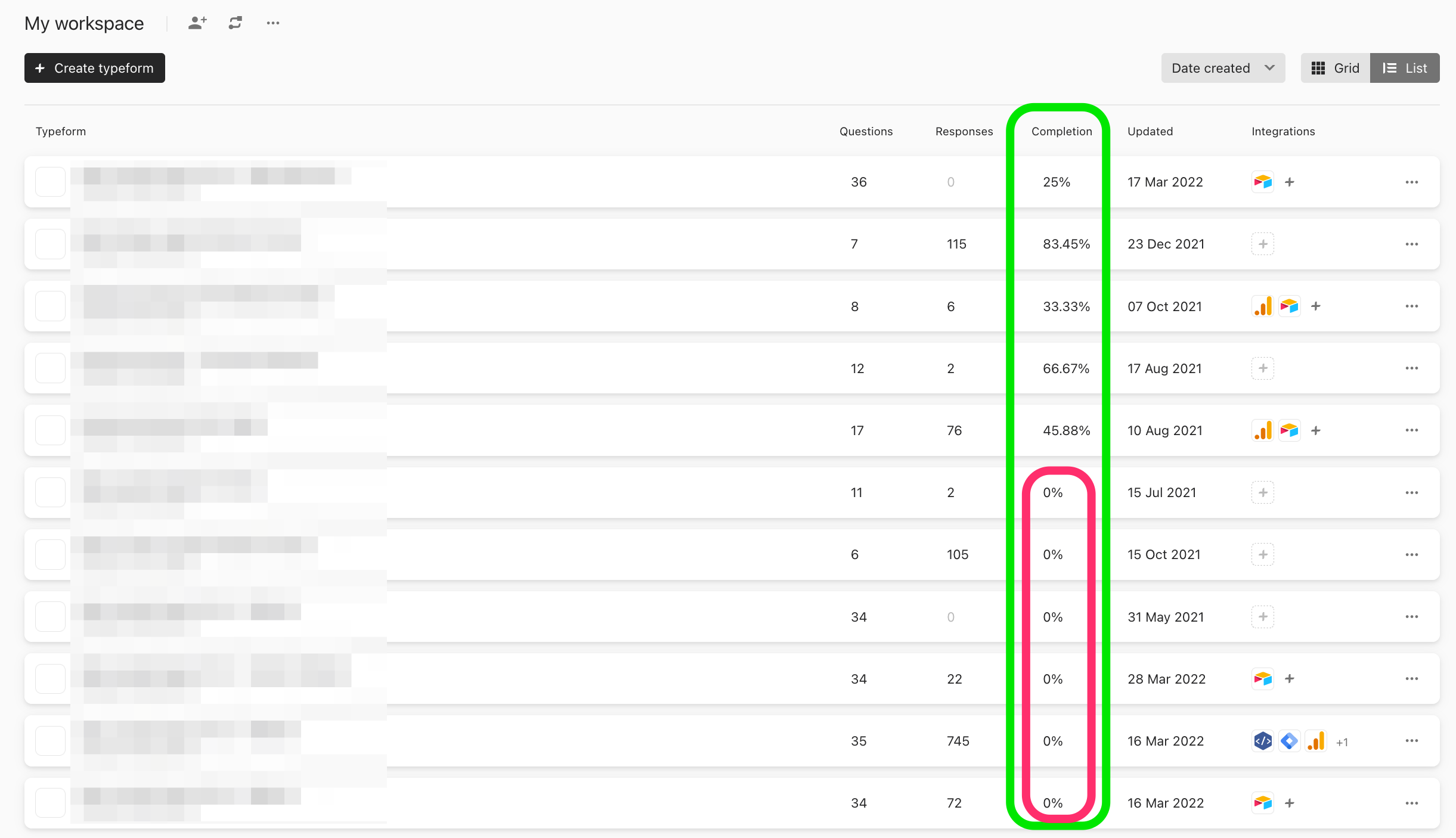
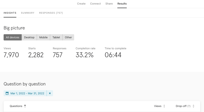
It’s one thing to collect data, but it’s another to see how your respondents are answering over a given period of time. If you loved the Insights panel of the builder, you’re going to fancy it even more now with the newest update from our product team - the performance trends!
If you’re a visual person like me, seeing data in a chart makes it much easier to comprehend versus a full list of numbers. Thankfully, the product team developed the Performance Trends so you can have a better understanding of how your respondents are answering over a given period of time.
How to use the new trends report
1. When you first land on the Insights page, you’ll see a lovely overview of the submission rate over time.
2. If you want to see how many respondents answered over a given period of time, you can use the filters and selectors to narrow it down for your given timeframe.
3. But it’s not just the submission rates you can view in the report! Take a peek into views, starts, completion rate, and time to complete as well.
4. Our product team even gave the chart a little pizzazz by allowing you to scroll through the dates in case you don’t want to use the filters feature.
Nothing like a little extra visuals to get a grasp on your data! How will you use the trend report? Any feature you’re most excited about? Let us know in the comments below!


