Looking at the image below, I want my picture options to appear on two rows of three.
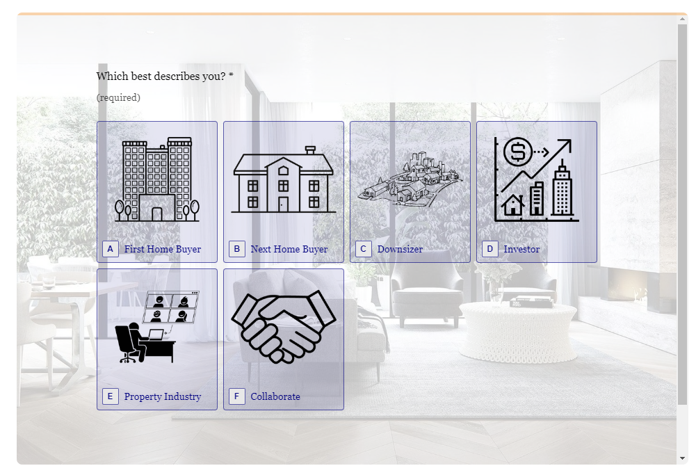
This image is taken on desktop with the Supersize option. Width 100% height 750px.
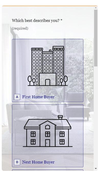
However, when Supersize is checked, the mobile version looks too big for what I want. See image below.
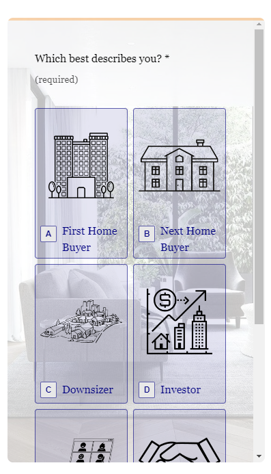
However, when Supersize is turned off, the mobile looks great. See below.
But with Supersize turned off, the desktop looks like this. Aesthetically, I’d prefer two rows of three options.
Any solutions available?
Are we able to lock the Supersize option according to screensize?
Are we able to specify how many rows or columns we want on each screensize?
My ideal scenario is for desktop to have two rows of three options and for mobile to have three rows of two options.
Thanks in advance!
Best answer by Gabi Amaral
Hello @Insider! Happy that you're here! 👋🏼
I'm afraid we haven't addedthe ability to lock the supersize option according to screensize or to set a number of picture choice items in linejust yet. The way it's set up is to automatically resize the picture choice boxes to fit within the browser/device that the respondent is using.
Something to keep in mind is that the supersize toggle will make the images bigger, but it will also autocrop them to a 4:3 aspect ration, so to avoid it being cropped in a way you don't find appealing, you may want to crop your images to a 4:3 ratio yourself before adding them, when you'll be using that option.
We've got a similar feedback about this in the past and our product team is aware of this. You can stay up to date with our product updates via our Product Digest posts in our Community here, or post/like other feature requests from your fellow Typeform users here.
Let me know if there's something else I can help with. Wishing you a great weekend! 😊


