
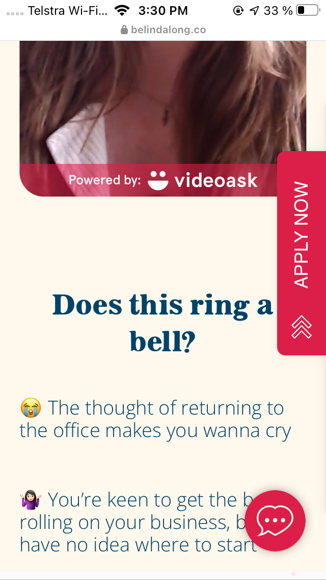
Hi everyone, I am trying to make the snippet on my Shopify-based site less invasive. Is there a way to hide it on mobile or force a resizing to a smaller button and font? Thanks a million!


Hi everyone, I am trying to make the snippet on my Shopify-based site less invasive. Is there a way to hide it on mobile or force a resizing to a smaller button and font? Thanks a million!
Best answer by mathio-tf
Hello
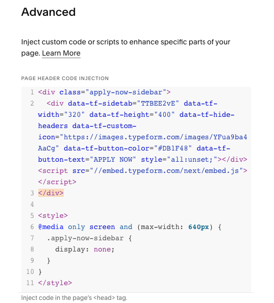
To hide the button on mobile you can do it using CSS:
<style>
/* hide the button on screens narrower than 600px */
@media only screen and (max-width: 600px) {
  .typeform-sidetab-button {
    display: none;
  }
}
</style>
You can use the same approach to resize the button too. It requires a bit more playing around with the embed code, but the idea is the same - use CSS media query to format the button based on screen size.
I created and example you can use as base for your own code:
https://glitch.com/edit/#!/tf-sidetab-responsive-button?path=index.html
Edit: I updated the solution above to target the button by correct class name.
Enter your E-mail address. We'll send you an e-mail with instructions to reset your password.


 Did the solution above work for you?
