https://sites.google.com/view/charangaelequipoa/inicio
https://sites.google.com/view/charangaelequipoa/contacto
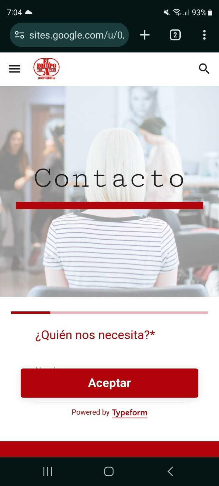
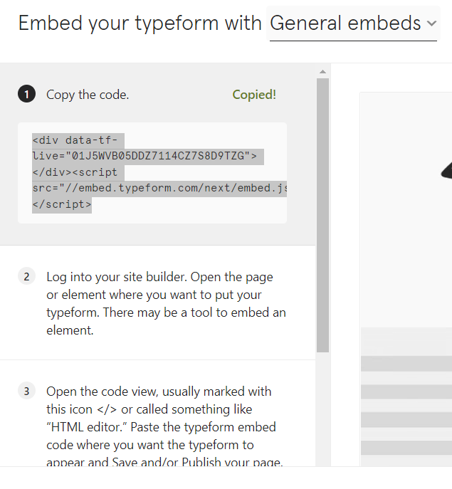
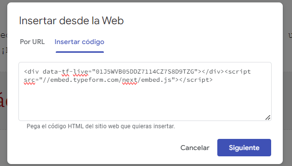
The form below is not quite useful on Mobile. The button “aceptar” fills all the screen and it is hard to find the boxes to text in. How can I make this button smaller or eliminate it working only with arrows?