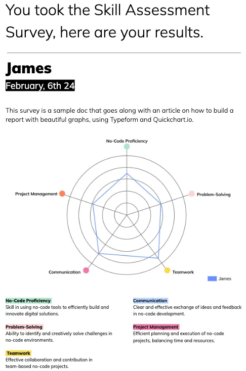
Hey there, it's Baptiste from Agent Studio! I want to share my journey of solving a common problem with you: creating beautiful charts from Typeform responses.
I had a client who needed spider charts within a report for their automation project. I tried different options like Google Sheets, Looker, and Docmaker, but none of them quite met the aesthetic standards we were aiming for. That's when I stumbled upon Quickchart.io, and it turned out to be the missing piece of the puzzle.
Here's the breakdown: I used Typeform to collect responses, Google Sheets for data management, and Quickchart.io for the chart creation.

To achieve the desired look, I created a background image using Figma and a Google Docs template to display the final result. By replacing variables and aligning the graph with the background image via Make, I was able to create visually stunning reports.
You can test how it works for yourself by filling in this dummy version of the typeform:
If you're curious about the entire workflow head over to the full tutorial post here on the Typeform Developer blog.
I explain there:
- How to create the typeform
- Calculating average scores for each assessment using Google Sheets
- Generating the graph with Quickchart.io
- Automatically inserting the graph into a Google Docs template via Make
- Sending the generated report automatically via email to the respondent
I hope you find this useful, I'd love to get your thoughts on this approach. What other use cases can you think of for this? Have you tried auto-generating graphs from Typeform responses and how does your method compare?
Thanks!


