Question

Horizontal alignment of options in embedded email

  • 28 May 2024
  • 6 replies
  • 60 views

Hi everyone! 

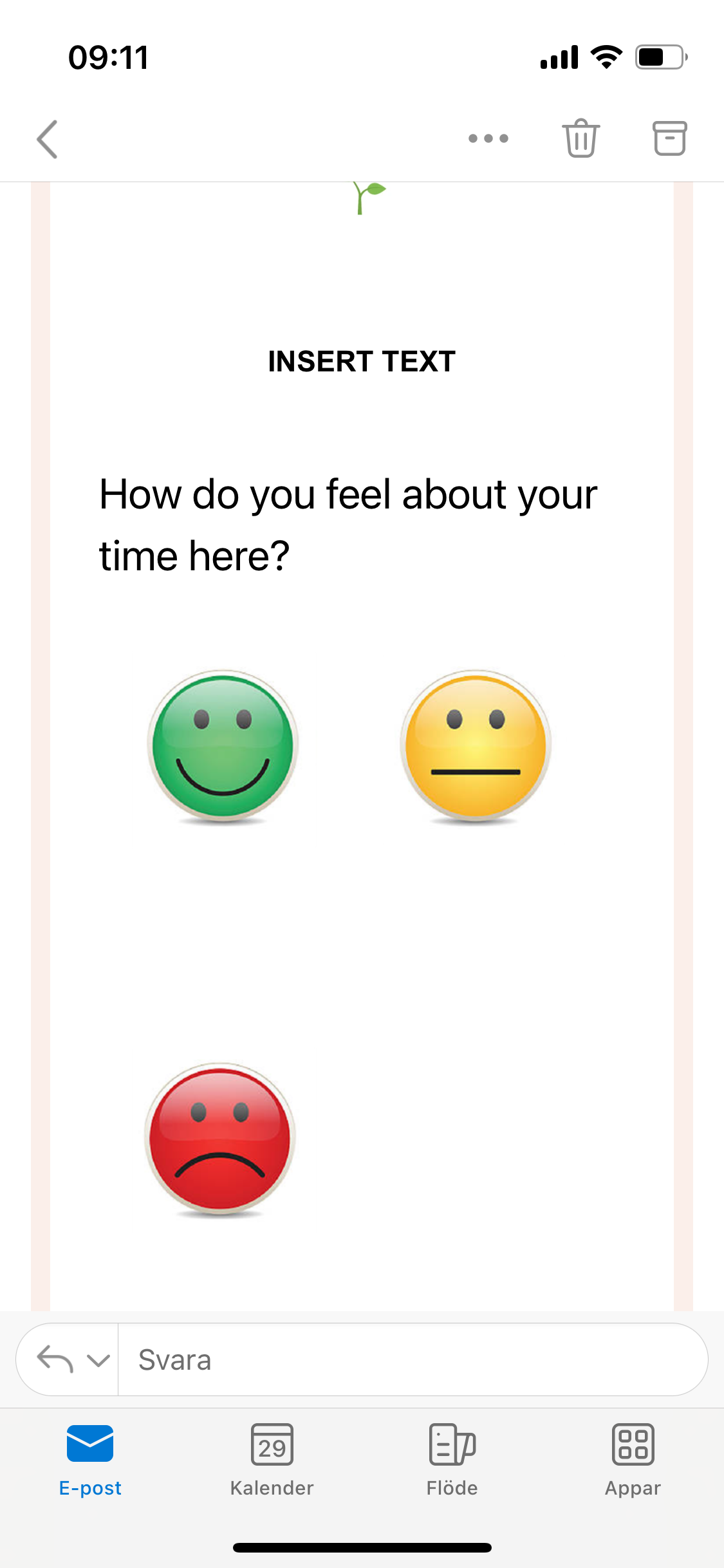
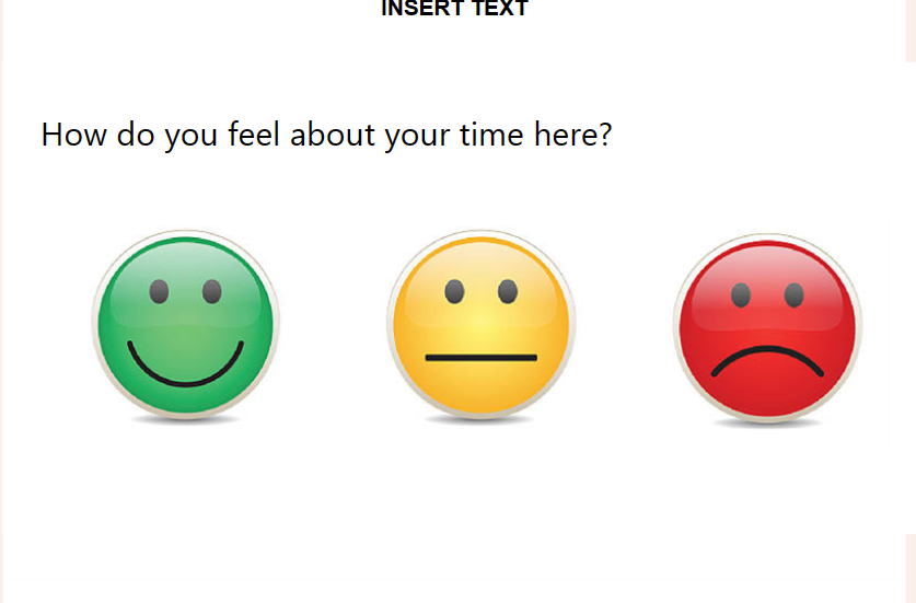
I am trying to embed a “picture choice” question in an email using Hubspot as my email distributer. My issue is that when it shows up on the mobile the options are vertically alligned which means that some optins show before others, which I am afraid might affect the answers. I would like to have them next to each other on the phone as it is on my computer. 


Anyone who know how I can fix this? I would really appreciate your help! ☀️

6 replies

Userlevel 7
Badge +5

Hi @EmmaCO Would you mind sending a screenshot of what you’re seeing and the code that’s in the email? Thanks in advance!

Hi Liz,

Absolutely, here it is:


And this is what I want:


This is the code:

<div class="mail-wrapper" style="" lang="und" dir="auto"> <table align="center" class="wrapper" border="0" cellpadding="0" cellspacing="0" role="presentation" style="background:#FFFFFF;background-color:#FFFFFF;width:100%"> <tbody> <tr> <td> <!--[if mso | IE]><table align="center" border="0" cellpadding="0" cellspacing="0" class="wrapper-outlook" role="presentation" style="width:640px;" width="640" bgcolor="#FFFFFF" ><tr><td style="line-height:0px;font-size:0px;mso-line-height-rule:exactly;"><![endif]--> <div style="margin:0px auto;max-width:640px"> <table align="center" border="0" cellpadding="0" cellspacing="0" role="presentation" style="width:100%"> <tbody> <tr> <td style="direction:ltr;font-size:0px;padding:0;text-align:center"> <!--[if mso | IE]><table role="presentation" border="0" cellpadding="0" cellspacing="0"><tr><td class="" width="640px" ><table align="center" border="0" cellpadding="0" cellspacing="0" class="" role="presentation" style="width:640px;" width="640" ><tr><td style="line-height:0px;font-size:0px;mso-line-height-rule:exactly;"><![endif]--> <div class="" style="margin:0px auto;max-width:640px"> <table align="center" border="0" cellpadding="0" cellspacing="0" role="presentation" style="width:100%"> <tbody> <tr> <td style="direction:ltr;font-size:0px;padding:20px 0;text-align:center"> <!--[if mso | IE]><table role="presentation" border="0" cellpadding="0" cellspacing="0"><tr><td class="" style="vertical-align:top;width:640px;" ><![endif]--> <div class="mj-column-px-640 mj-outlook-group-fix" style="font-size:0px;text-align:left;direction:ltr;display:inline-block;vertical-align:top;width:100%"> <table border="0" cellpadding="0" cellspacing="0" role="presentation" style="vertical-align:top" width="100%"> <tbody> <tr> <td align="left" class="" style="font-size:0px;padding:10px 25px;word-break:break-word"> <div style="font-family:system-ui,-apple-system,BlinkMacSystemFont,'Segoe UI',Roboto,Oxygen,Ubuntu,Cantarell,'Fira Sans','Droid Sans','Helvetica Neue',sans-serif;font-size:22px;font-weight:normal;line-height:32px;text-align:left;color:#000000">How do you feel about your time here?</div> </td> </tr> <tr> <td align="left" class="" style="font-size:0px;padding:10px 25px;word-break:break-word"> <div style="font-family:Ubuntu,Helvetica,Arial,sans-serif;font-size:13px;line-height:1;text-align:left;color:#000000"><div style="margin:0 -5px"><div class="yyy" style="width:33%;min-width:130px;float:left;text-align:left"><div style="border:1px solid #FFFFFF;border-radius:3px;margin:0 5px 10px 5px"><a href="https://coly.typeform.com/to/lSCjEmtS?typeform-medium=embed-email#answers-01HYX7ESXVTA7Y5K4ZJZAQD6CR=372b42dc-7137-4c94-8477-597f94c4f357" style="display:block;text-decoration:none;padding:10px;min-height:170px;background-color:rgba(255, 255, 255, 0.1)"><div style="position:relative;height:170px;overflow:hidden;text-align:center"><img alt="Happy" src="https://images.typeform.com/images/nreqH5NAYzXT/choice/default/png" style="max-width:100%;max-height:100%;position:absolute;top:0;bottom:0;left:0;right:0;margin:auto"></div></a></div></div><div class="yyy" style="width:33%;min-width:130px;float:left;text-align:left"><div style="border:1px solid #FFFFFF;border-radius:3px;margin:0 5px 10px 5px"><a href="https://coly.typeform.com/to/lSCjEmtS?typeform-medium=embed-email#answers-01HYX7ESXVTA7Y5K4ZJZAQD6CR=01HYX7ESXVFHTN574965WDBM20" style="display:block;text-decoration:none;padding:10px;min-height:170px;background-color:rgba(255, 255, 255, 0.1)"><div style="position:relative;height:170px;overflow:hidden;text-align:center"><img alt="Neutral" src="https://images.typeform.com/images/Jw3APrFh6w82/choice/default/png" style="max-width:100%;max-height:100%;position:absolute;top:0;bottom:0;left:0;right:0;margin:auto"></div></a></div></div><div class="yyy" style="width:33%;min-width:130px;float:left;text-align:left"><div style="border:1px solid #FFFFFF;border-radius:3px;margin:0 5px 10px 5px"><a href="https://coly.typeform.com/to/lSCjEmtS?typeform-medium=embed-email#answers-01HYX7ESXVTA7Y5K4ZJZAQD6CR=01HYX7ESXVPF8M0NEKN3QKS2Q0" style="display:block;text-decoration:none;padding:10px;min-height:170px;background-color:rgba(255, 255, 255, 0.1)"><div style="position:relative;height:170px;overflow:hidden;text-align:center"><img alt="Not happy" src="https://images.typeform.com/images/ndfaRRwBmtKx/choice/default/png" style="max-width:100%;max-height:100%;position:absolute;top:0;bottom:0;left:0;right:0;margin:auto"></div></a></div></div></div></div> </td> </tr> </tbody> </table> </div> <!--[if mso | IE]></td></tr></table><![endif]--> </td> </tr> </tbody> </table> </div> <!--[if mso | IE]></td></tr></table></td></tr></table><![endif]--> </td> </tr> </tbody> </table> </div> <!--[if mso | IE]></td></tr></table><![endif]--> </td> </tr> </tbody> </table> <style>#outlook a{padding:0}body{margin:0;padding:0;-webkit-text-size-adjust:100%;-ms-text-size-adjust:100%}table,td{border-collapse:collapse;mso-table-lspace:0pt;mso-table-rspace:0pt}img{border:0;height:auto;line-height:100%;outline:none;text-decoration:none;-ms-interpolation-mode:bicubic}p{display:block;margin:13px 0}@media only screen and (min-width:480px){.mj-column-px-640{width:640px !important;max-width:640px}}.moz-text-html .mj-column-px-640{width:640px !important;max-width:640px}.mj-column-px-640{width:100% !important;max-width:640px}/*!sc*/data-styled.g1[id="sc-global-juhJZJ1"]{content:"sc-global-juhJZJ1,"}/*!sc*/@media only screen and (max-width:640px){.yyy{width:50% !important}}/*!sc*/data-styled.g2[id="sc-global-hCRJDP1"]{content:"sc-global-hCRJDP1,"}/*!sc*/</style><link href="https://font.typeform.com/dist/google/ubuntu/index.css" rel="stylesheet" type="text/css"></div>


Thank you so much for your help!! ☀️🌱

Userlevel 7
Badge +5

Hi @EmmaCO Oh, I see - thank you. I believe this has something to do with the browser size, but @mathio do you know if there is any way to adjust this on a mobile device? 

Userlevel 7
Badge +5

Tagging @mathio and @picsoung to see if they are able to help with this!

Thank you, I really appreciate it! Hope we can find a solution to this!

Userlevel 7
Badge +5

This is the current design for picture choice block. I cant promise any changes, but I will raise this with our designer to see if there is anything we can do about it.

Reply