It’s looking great on desktop but taking up a huge part of the screen on mobile, so we’d like to find an easy way to display on desktop only. Any guidance on this please?

Answered
Is it possible for the side tab to only display on desktop?
Best answer by mathio-tf
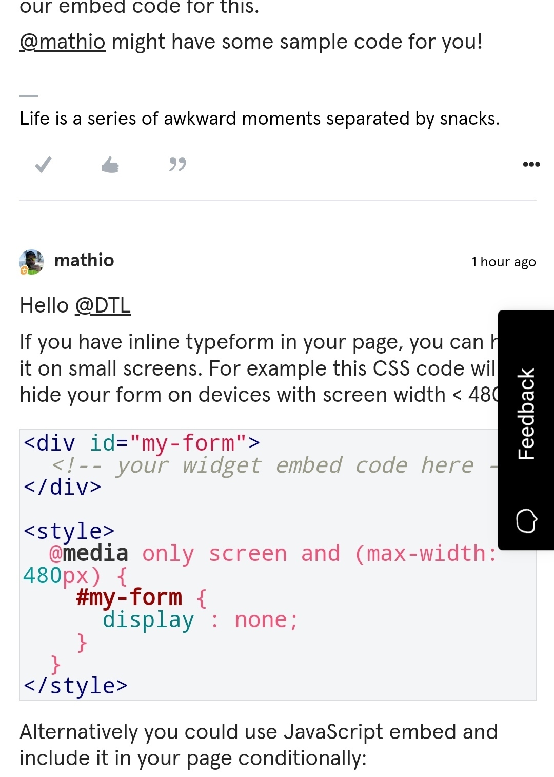
Hello
If you have inline typeform in your page, you can hide it on small screens. For example this CSS code will hide your form on devices with screen width < 480px.
<div id="my-form">
  <!-- your widget embed code here -->
</div>

<style>
  @media only screen and (max-width: 480px) {
    #my-form {
      display : none;
    }
  }
</style>
Alternatively you could use JavaScript embed and include it in your page conditionally:
<script>
  if (window.innerWidth > 480) {
     window.tf.createWidget(/* your embed settings */)
  }
</script>
However typeforms can be displayed on mobile devices too. If you are interested in displaying your typeform on mobile device too, please share your page URL with us and we can have a look at your embedded typeform together.


Enter your E-mail address. We'll send you an e-mail with instructions to reset your password.