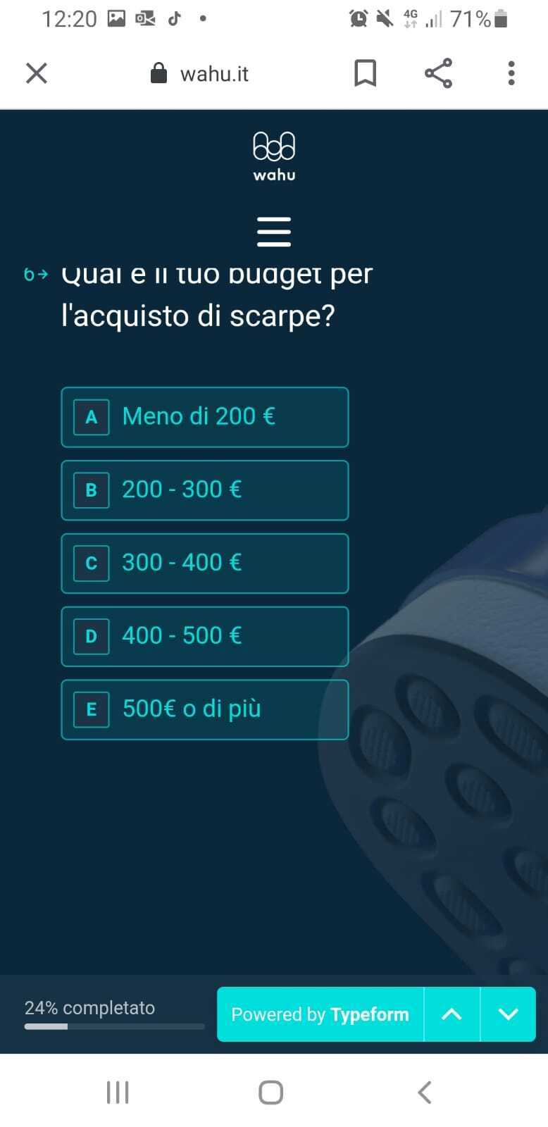
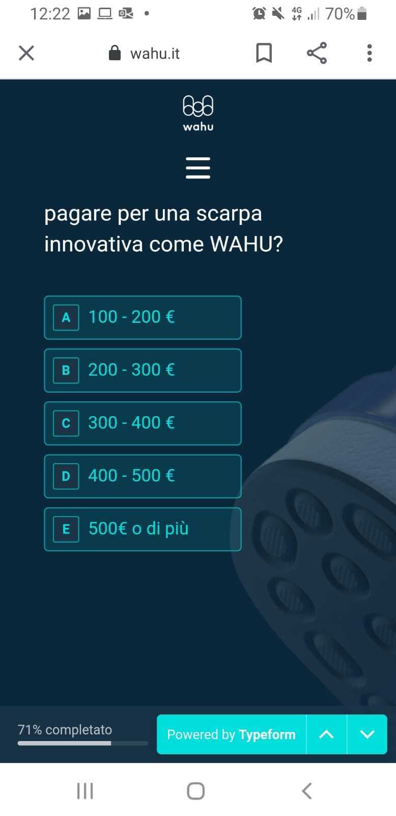
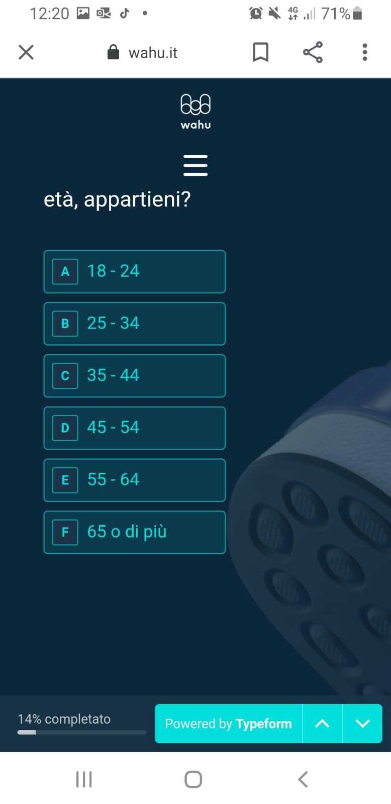
Hey @Carolina. Welcome to our community.
I shared this with the team (who actually said your typeform looks awesome embedded on your site ).
It looks like the nav bar on your site (mobile) is a little too big and is overlapping with the typeform.
One of our devs told me that, very likely, the reason why this only happens on Android is due to screen resolution being different from Iphone - which fits more content as the text often renders smaller.
I’ll keep asking questions, but we at least know the cause !
@Carolina If you don’t mind sharing the full URL where the form is, I can take a peek at the code, too. Like @Gabriel said, the header is most likely causing the issue here, and lowering the z-index of the header will help.
Hey guys, thanks for the answers.
But actually we have been also sharing the direct link to the survey with users, and some are still having issues.
Here is the directlink: https://rtxmqyduqso.typeform.com/to/IBJWuTnK
Hi @Carolina thanks for sending that over! The original screenshot shows the form at a URL beginning with wahu.it - is this form within an app? Or would you mind sharing the URL where that form is added so we can test this directly? If you also happen to have a video of what you’re seeing on Android with the direct link, that would be handy, too, so I can try to reproduce the issue on my Android.