Images and accessibility

  • 16 June 2024
  • 9 replies
  • 61 views

I am very new to Typeform and I’m not a professional (at all). I need a bit of help. I am a community cycling activist and I need to create a survey to find out why people don’t cycle in our community. We need 1000 responses from a population of about 30,000, along the Tyne Valley in Northern England.

We have selected Typeform because we like the way you can navigate questions depending on the answers and also because the graphic interface is highly rated. I have created a series of questions and created the logic, which has gone well. However, I  really really need to use images and graphics to draw in the non-cyclists, the sceptics, the unengaged and the reluctant. I have struggled to create images that work in screen and phone mode, and don’t reduce the accessbility and readability of the text. So far, I have had a 50% drop off of responders, which is terrible. Before I share my survey more widely I need to fix this, but I really don’t know how. Can anyone advise me? 

9 replies

Userlevel 7
Badge +5

Hi @Zaria First, welcome to typeform! Happy to have you here. And don’t worry, I’m hardly a professional, but thankfully we have a lot of great folks in the community who have some lovely advice. 

I moved your post under our Tune Up Your Typeform section so we can help offer some advice. 

Do you mind sharing: 

  • the URL of your form
  • a screenshot of your dropoffs so we can see what’s happening? 

Thanks in advance!

Hi Liz, thanks for the welcome, it’s great to know there’s a community out there to help, I greatly appreciate it. 

Here’s my survey. 

https://cgkbmftpij9.typeform.com/BicycleSurvey

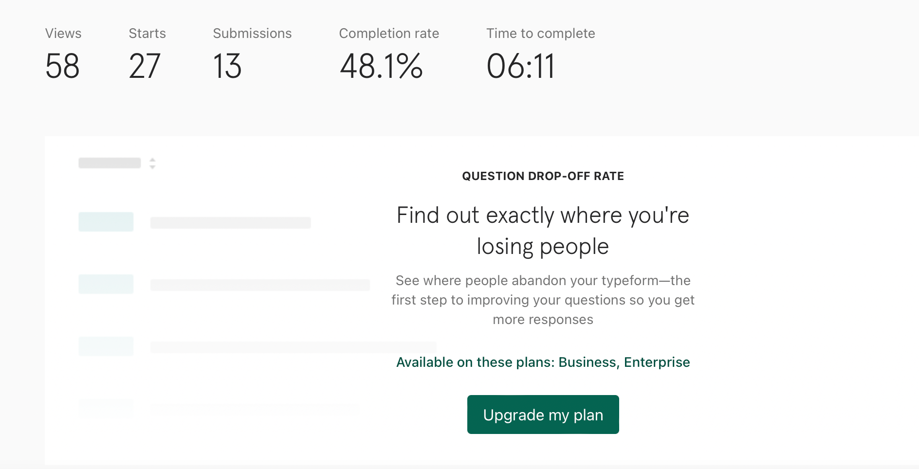
This is the latest version, which is less textured than the previous version. When you say ‘drop-offs’ do you mean people who’ve responded? I don't have the access required to see where they’re leaving the survey, but I currently have 13 responses and a 48% completion rate. Not happy. See screenshot attached. Thanks for any help you can give. Zaria


HI Liz, 

Is there any update? Anything you can spot that might help me? Thank you, I really appreciate the support. Zaria

Userlevel 7
Badge +5

Hi @Zaria Thank you for sharing this! And sorry, I thought you had access to the drop-off information. 

Give me a bit to look through the form and make some suggestions! Also, how are your respondents accessing the form? Are you emailing it to them or is it embedded on a website? 

Hi @Zaria, Here are a few tips after taking your quiz. I think the questions are fine, but the format could use some improvements.

1 - To make the intro more friendly, why not add a photo and move the resource links to the end of the survey. 

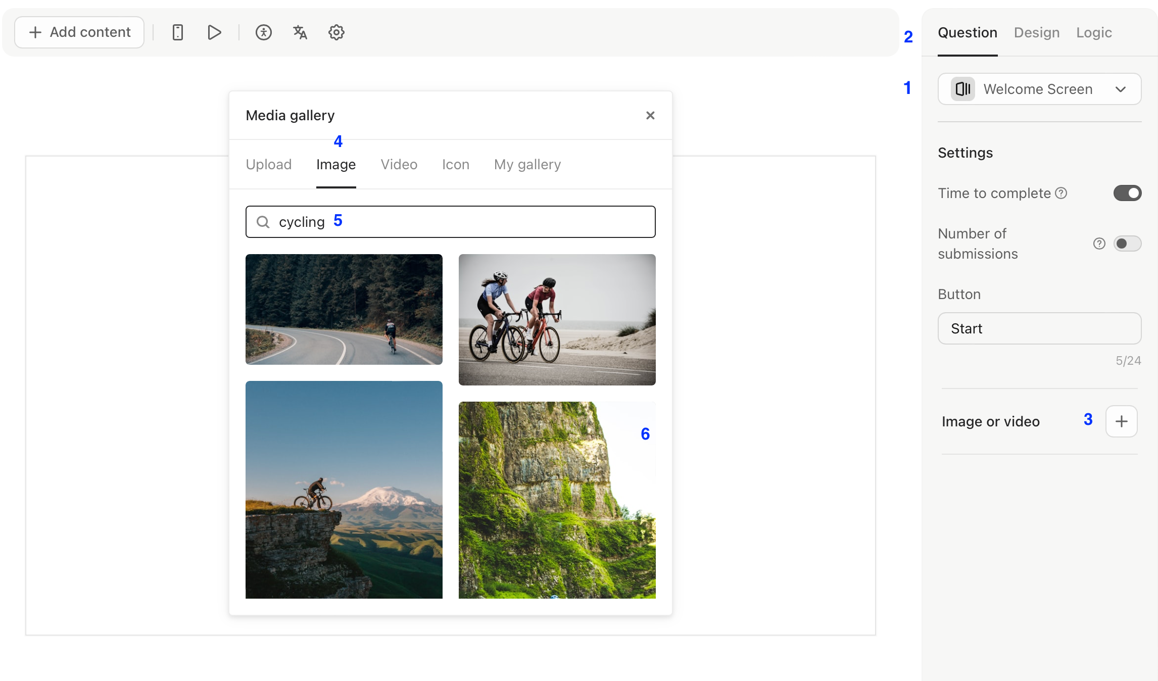
  1. Typeform integrates with an amazing free photo library!  I am including some instructions and a screenshot here for adding free photos.
    1.  Go to the welcome screen
    2.  make sure you are at the question menu
    3. Click the plus sign to add image or video
    4. select image on the media pop up menu
    5. type in cycling 
    6. voila - lots of open source images to choose from
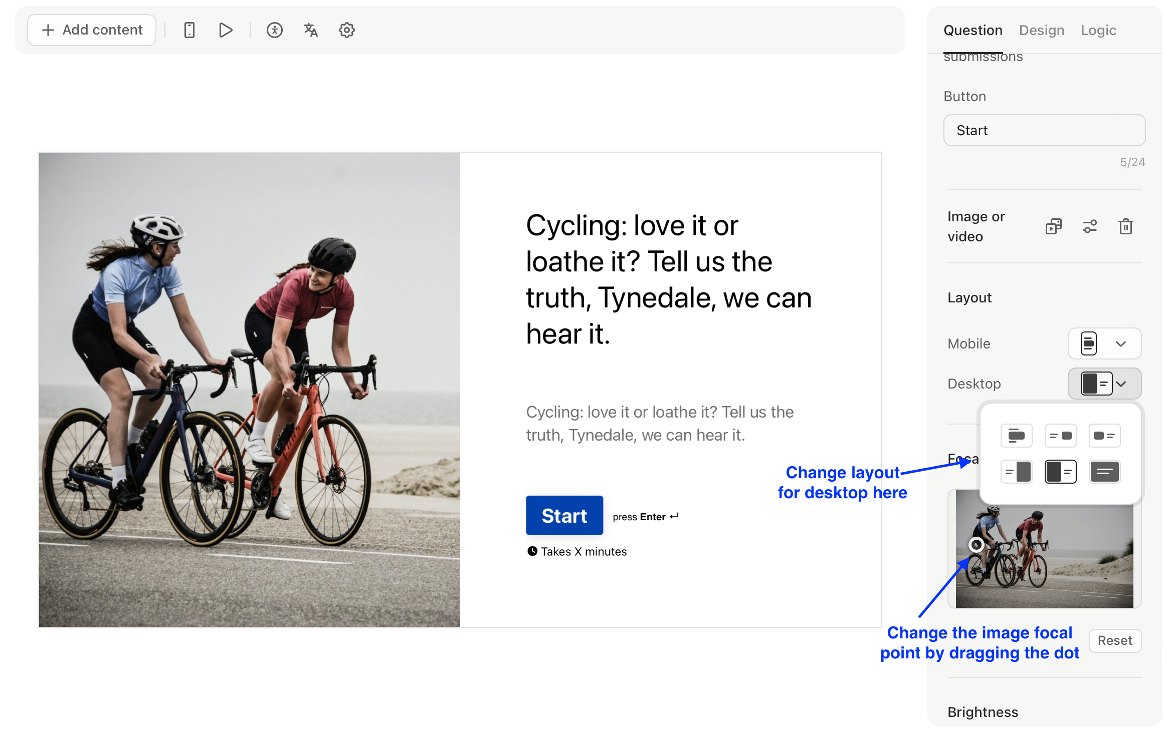
  1. I recommend adding images for all of the questions as above in step 2. Once you add the image, a menu appears under the image section (see image below) with additional options.


  1. I suggest removing the description text under every question—your questions are well-written and self-explanatory, Sometimes clarification is needed, but not in your case. 
  2. Reducing  the number of questions will probably increase the completion rate—whenever I am blasting an email survey to a large population, I use as few questions as possible. I recommend no more than 10, including demographic information. I know it’s hard, but the more questions, the more you are likely to see drop off.
  3. On the exit screen, why not add a nice family photo? Or better yet, add this at the beginning to build a bit of trust by putting a face and name to your survey?
  4. I suggest keeping the format consistent - use sentence case, or capitalize every word, avoid all caps, but try to be consistent in how you are labeling the answer choice text, I see a lot of differences with some all caps, some all lowercase, etc.

Overall, I think the survey is well-written. I hope these tips to improve design are helpful! 

Thank you so much for this, I really appreciate the detail and the opinions. I’ll have a go at doing what you suggest and keep pushing on. There are some great ideas here, it was just what I was looking for. 


Thanks again, much appreciated. What’s your name? You’re not Liz, are you? 

Zaria, 

Hi @Zaria I’m so glad it was helpful! Would love to hear if/how your results shape up. My name is Alex, I’m just another creator using Typeform :).

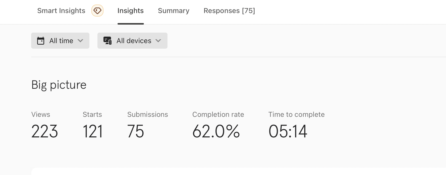
Hi Alex, thanks for the help. Results have indeed improved. Looking for 1000 responses over about nine months, so this is a great start. Response rate has gone up, and numbers abandoning the survey going down. Baby steps but getting there. Appreciate your help. 


Userlevel 7
Badge +5

Oh wow, @Zaria ! This is great to see! Congrats!

Reply