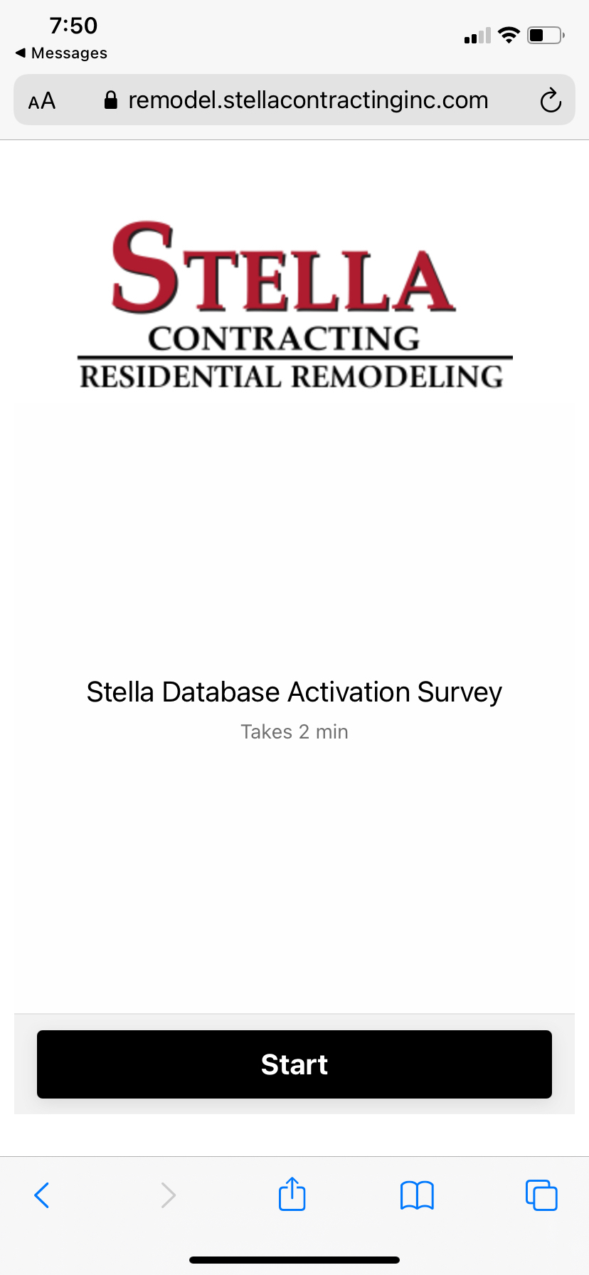
Why is this screen showing up on my survey when viewed on mobile? I have no welcome screen.
Th
anks
Best answer by Mariana
View originalWhy is this screen showing up on my survey when viewed on mobile? I have no welcome screen.
Th
anks
Best answer by Mariana
View originalThe option name data-tf-inline-on-mobile
is for when you are embedding as HTML snippet. For embedding via JS or React you should use inlineOnMobile
attribute.
The option name data-tf-inline-on-mobile
is for when you are embedding as HTML snippet. For embedding via JS or React you should use inlineOnMobile
attribute.
Great thanks that works!
Having same problem with mobile showing the title screen
does the data-tf-inline-on-mobile replace BOTH data tf attributes? or just one of them?
Will this affect how it displays on Desktop?
data-tf-iframe-props="title=TITLE OF SURVEY”
data-tf-medium="snippet"
Hi
Hi
I had a question about the solution shared above. Where can I add the code with the updated embed format?
*My Typeform Code*
<div data-tf-widget="pSDHIPEX" data-tf-hide-headers data-tf-iframe-props="title=Photoshoot Makeup" data-tf-medium="snippet" style="width:100%;height:400px;"></div><script src="//embed.typeform.com/next/embed.js"></script>
**
Option 1:
Try adding ?typeform-welcome=0
after the URL in the embedded code.
Hello
Could you please give a guide for dummies (like me) to get the form to work on mobile without showing the form name and “Start” button at first? I don’t have any welcome screen on my form, and it works nicely on desktop, but the form name shows on mobile. I want that away and just have the question shown.
I tried the data-tf-inline-on-mobile in the code, didn’t do anything.
Hello
if you prefer not to touch the embed code directly, you can do this on the latest share page.:
Alternatively you can also add data-tf-inline-on-mobile
attribute to your existing embed code manually. Please refer to this help article (last section).
The option name data-tf-inline-on-mobile
is for when you are embedding as HTML snippet. For embedding via JS or React you should use inlineOnMobile
attribute.
Hello Mathio,
I have a typeform with no welcome screen. It is initiated by a user event via your Embed SDK. When on mobile would I like the form to go fullscreen and show the first question directly.
My problem:
Is it possible to go fullscreen on mobile, without showing the form title and the “start” button using the Embed SDK?
You have two options:
<div id="form"></div>
<script src="//embed.typeform.com/next/embed.js"></script>
<link rel="stylesheet" href="//embed.typeform.com/next/css/widget.css" />
<link rel="stylesheet" href="//embed.typeform.com/next/css/popup.css" />
<script>
const container = document.querySelector('#form')
const isSmallScreen = window.innerWidth < 800
if (isSmallScreen) {
const button = document.createElement('button')
button.innerText = 'click to open form'
button.onclick = () => {
window.tf.createPopup('Cqrg7cgL').open()
}
container.append(button)
} else {
container.style.width = '100%';
container.style.height = '500px';
window.tf.createWidget('Cqrg7cgL', { container })
}
</script>
This confirmed my suspicion that there were no direct solution to my problem.
For the wishlist: Since the createWidget solution works excellent to trigger externally, both on desktop (inline) and on mobile (fullscreen), would it be great if it was possible to turn the extra welcome screen off on mobile.
Thanks a lot for the quick answer and for the suggestion to use multiple embed strategies, I’ll have a look!
The problem is that it is not easy to get good UX on mobile when using the inline-mode (unless the page layout is completely free from other elements). The fullscreen mode solve all issues with keyboards making the page jump (Safari..), address fields hiding navigation buttons, scrolling vs. swiping etc and the user see only the form.
This is why my question revolved around using the fullscreen mode, without the placeholder, which isn’t possible.
Enter your username or e-mail address. We'll send you an e-mail with instructions to reset your password.