
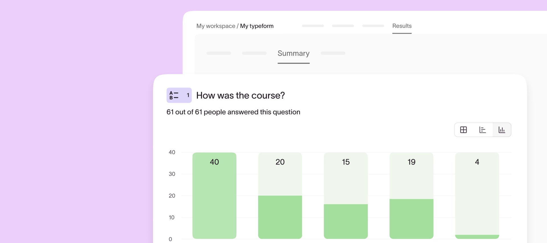
Understanding responses at scale shouldn’t require exporting to spreadsheets or wrestling with raw data. That’s why we’re excited to announce that a fresh, upgraded Results Summary page is on the way! Check out a sneak peek below.
The updated experience makes it easier than ever to spot trends, compare performance, and take action, right from inside Typeform.
What’s new?
- Interactive charts and tables: Visualize results with auto-formatted bar charts, NPS visuals, comparison views, and more.
- Smart formatting: Your charts adapt to long text, big data sets, and screen size so insights stay clean and clear.
- Descriptive stats: Instantly see counts, percentages, averages, and more—no spreadsheet required.
Why it matters:
Until now, extracting insights from large response sets required a lot of manual work. You’ve told us this in feedback and support tickets—and we listened. The upgraded Results Summary page gives you a faster, clearer way to understand your data and share impact across your team.
Whether you’re running a brand survey, collecting NPS feedback, or qualifying leads, this update helps you:
✔ Save time with built-in, tailored visualizations
✔ Segment your results in just a few clicks
✔ Make smarter decisions—faster
Keep an eye out for the new Summary page rolling out soon. We can’t wait to hear what you think! 👀