Hey there folks!
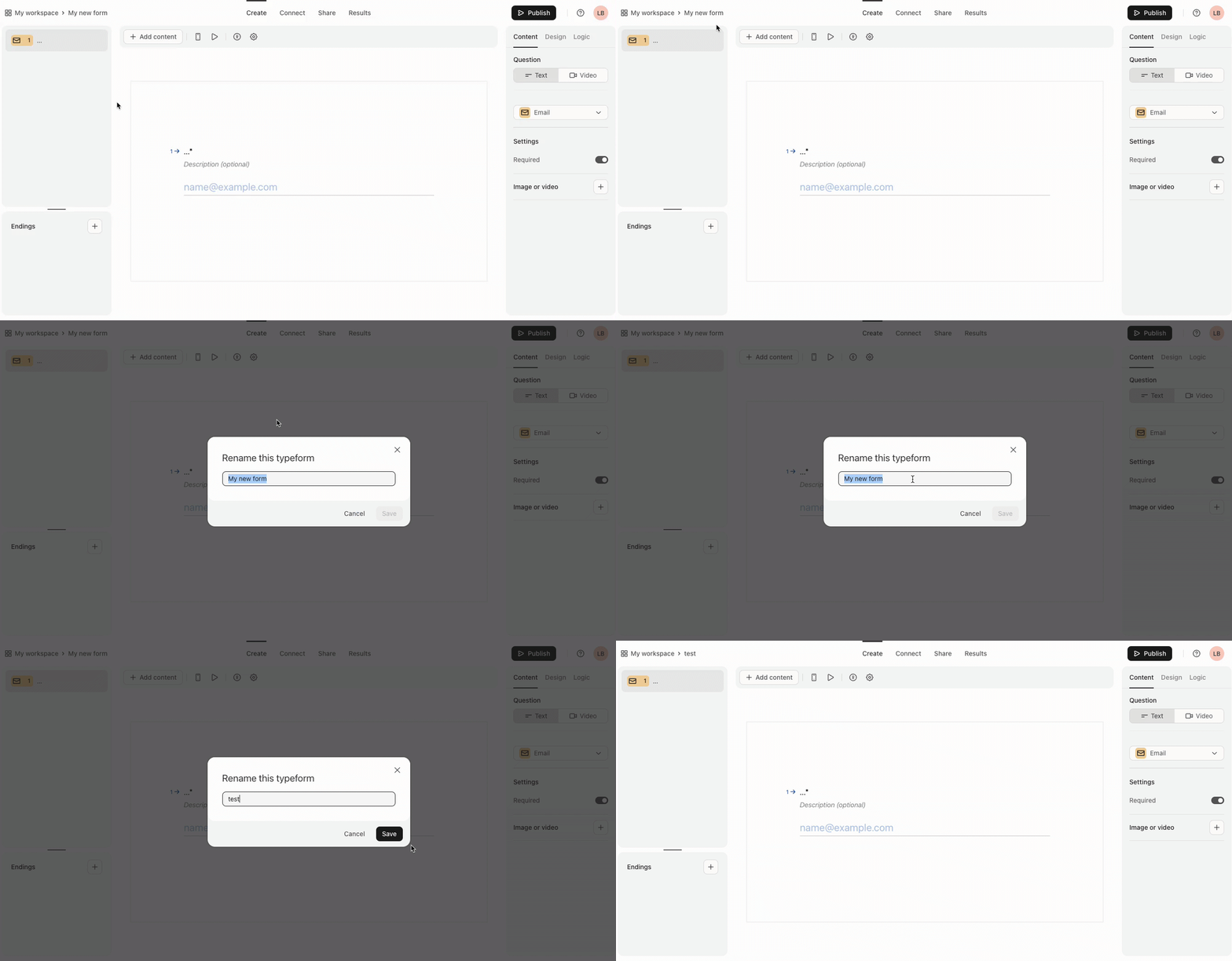
Exciting news: we’ve been doing some spring cleaning and we’re about to launch a new builder and workspace design to help make your typeform-building experience more intuitive! 🪄
If you’re brand new to Typeform, you will already be seeing the new-look design in your account 💁 For those of you that are old skool typeformers you should see the revamped interface appearing very soon.
Here’s a quick look:
What’s new
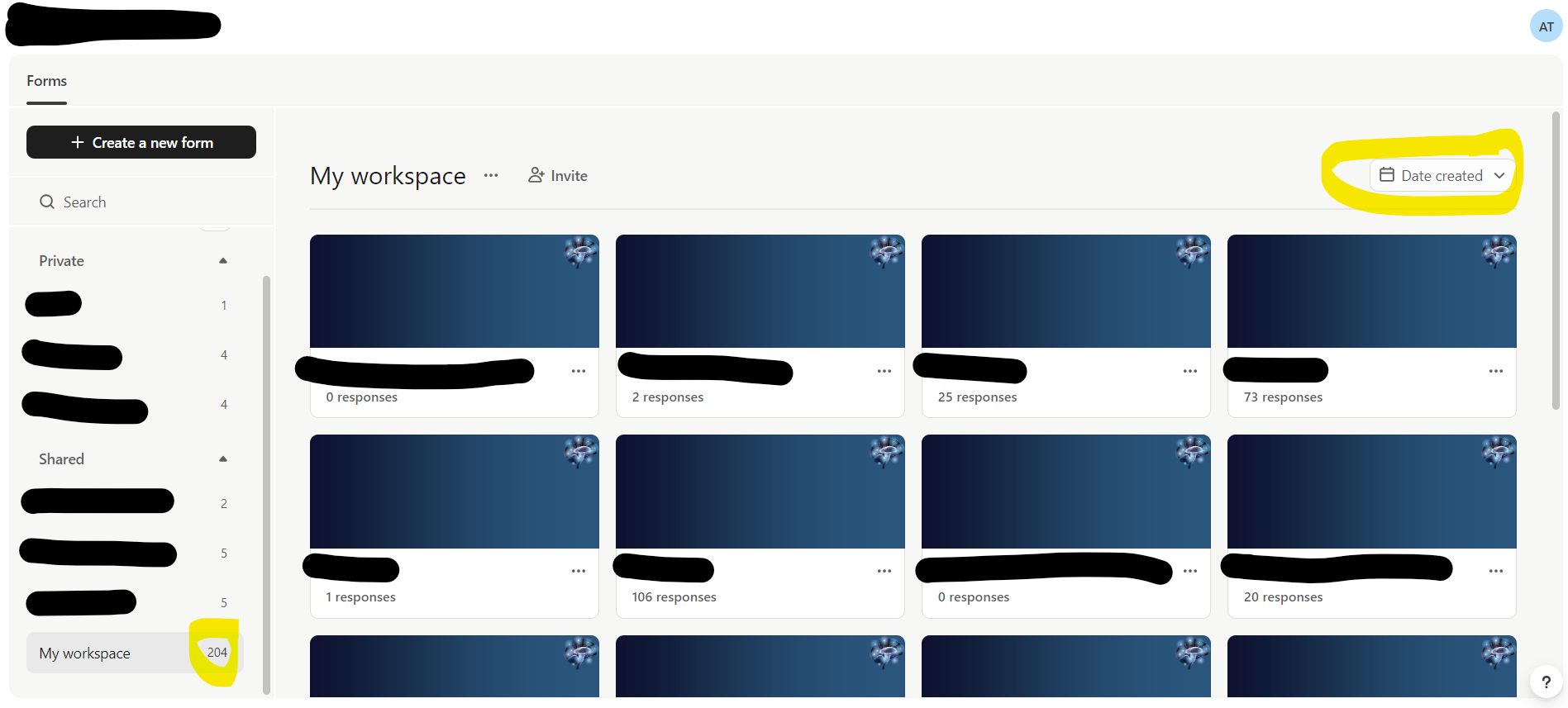
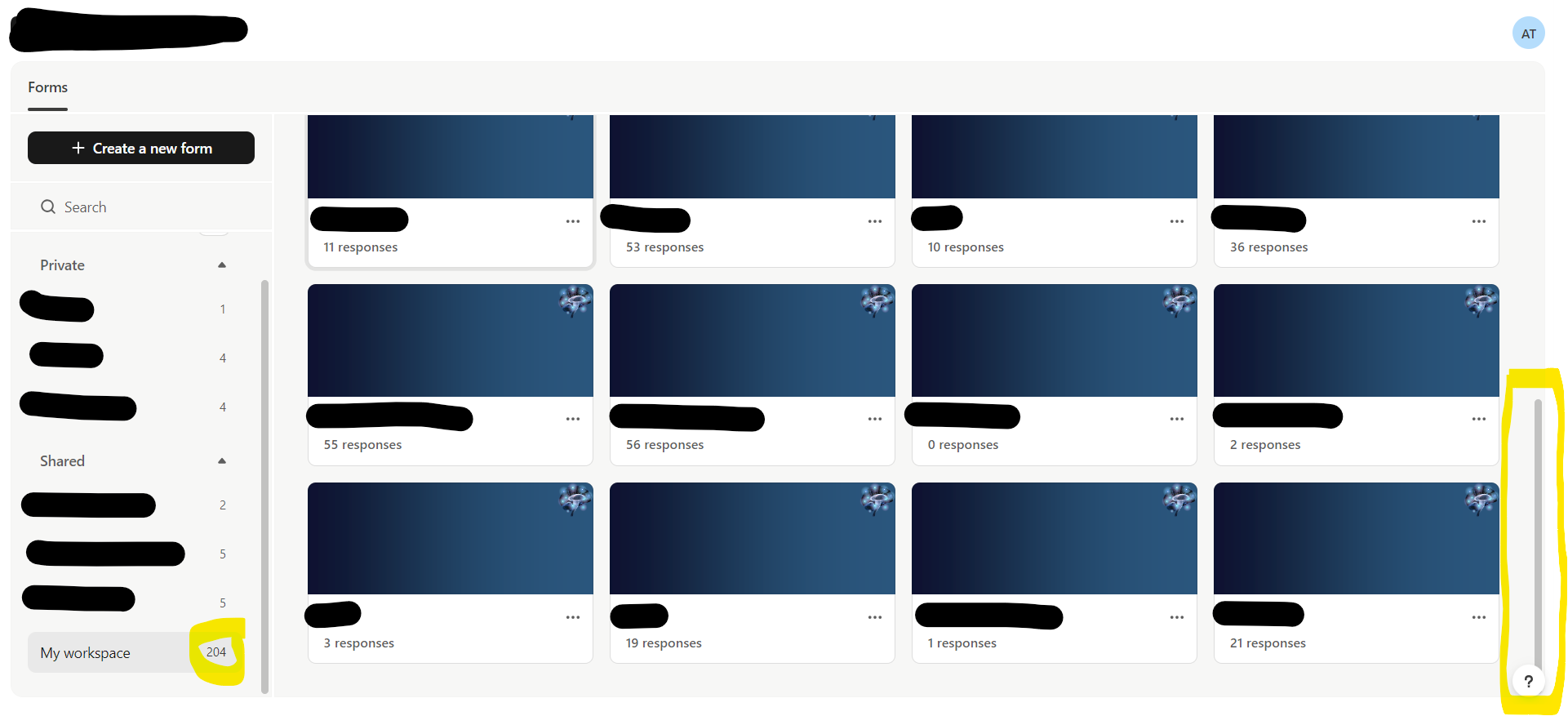
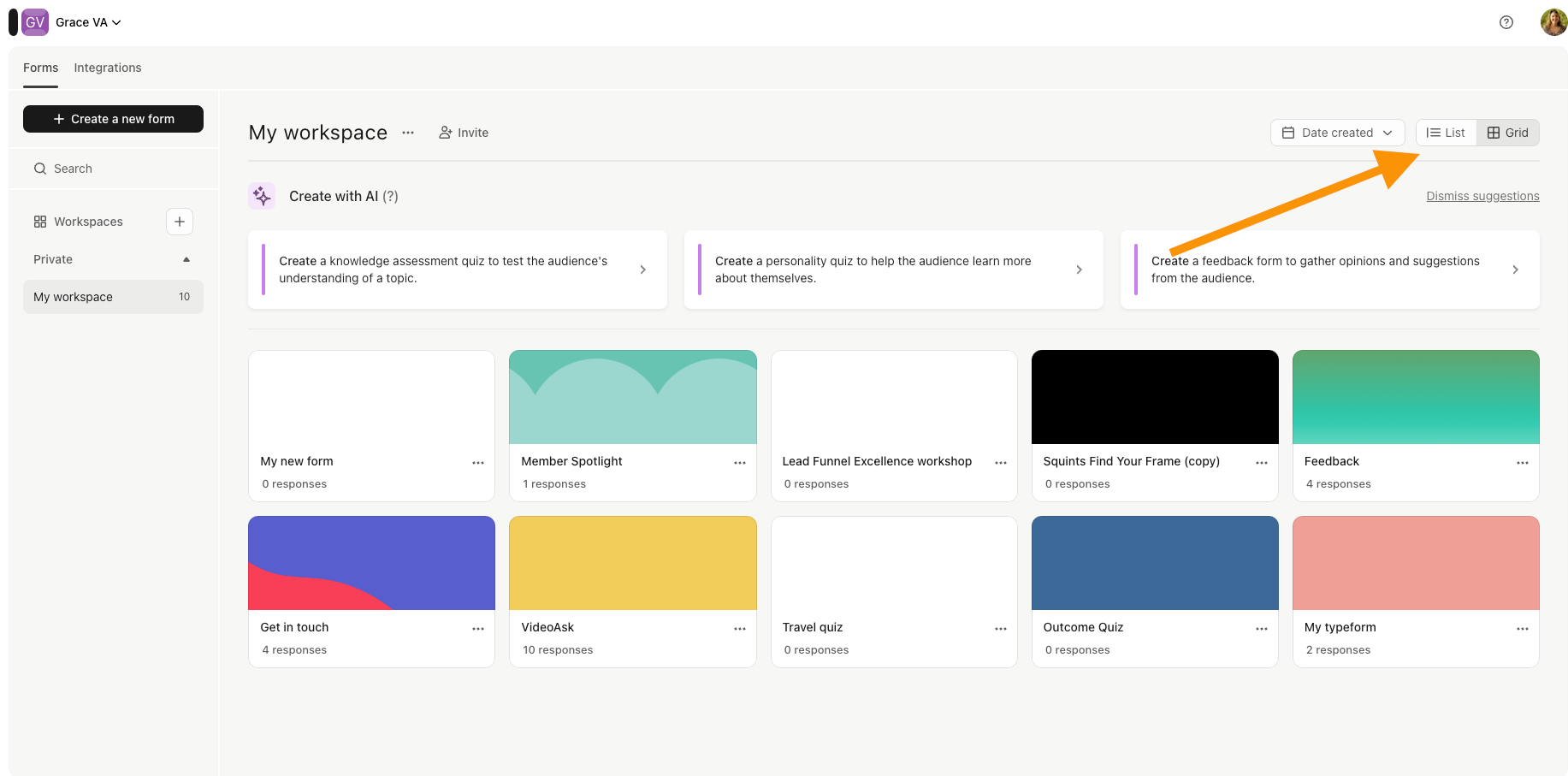
You’ll notice a new-look workspace. You can still switch between list and grid view to keep track of all the typeforms you’ve created:
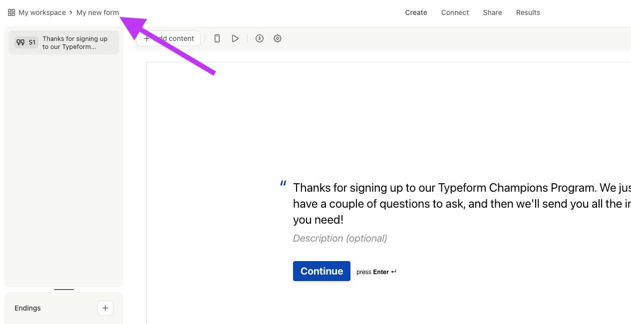
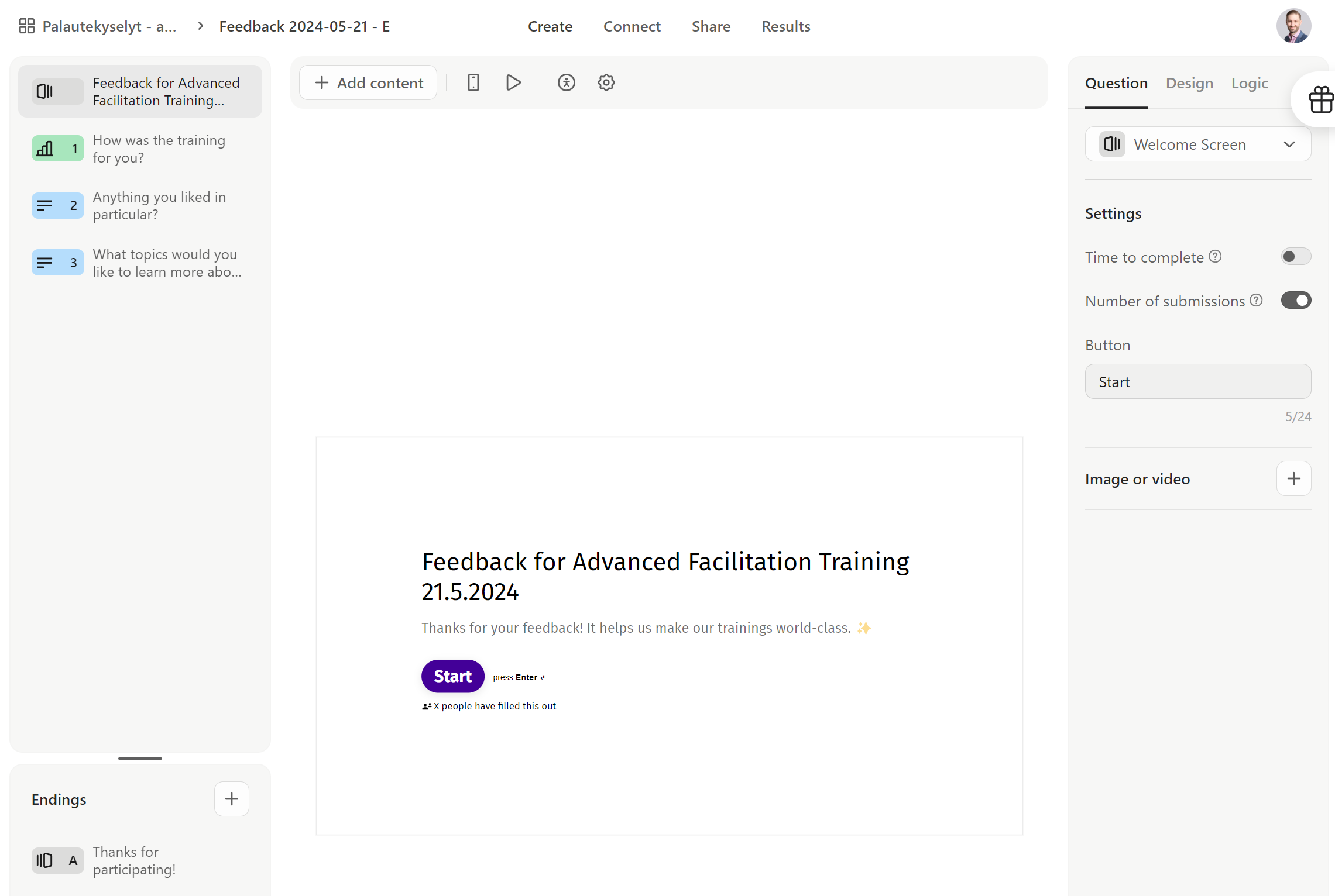
Once you’re in the builder, here are some changes to look out for:
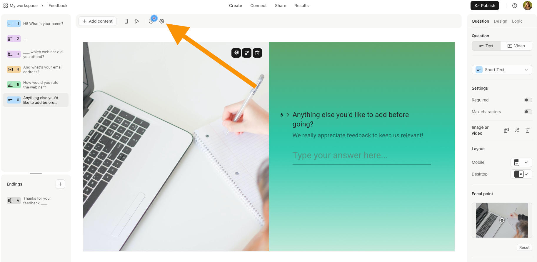
There’s a new top toolbar:
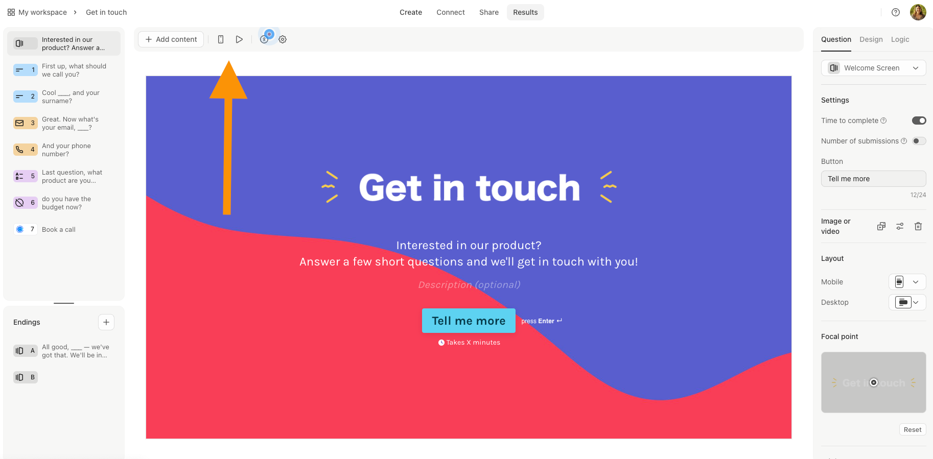
This is where you’ll find the accessibility checker, mobile/desktop editor toggle, form preview and form settings.
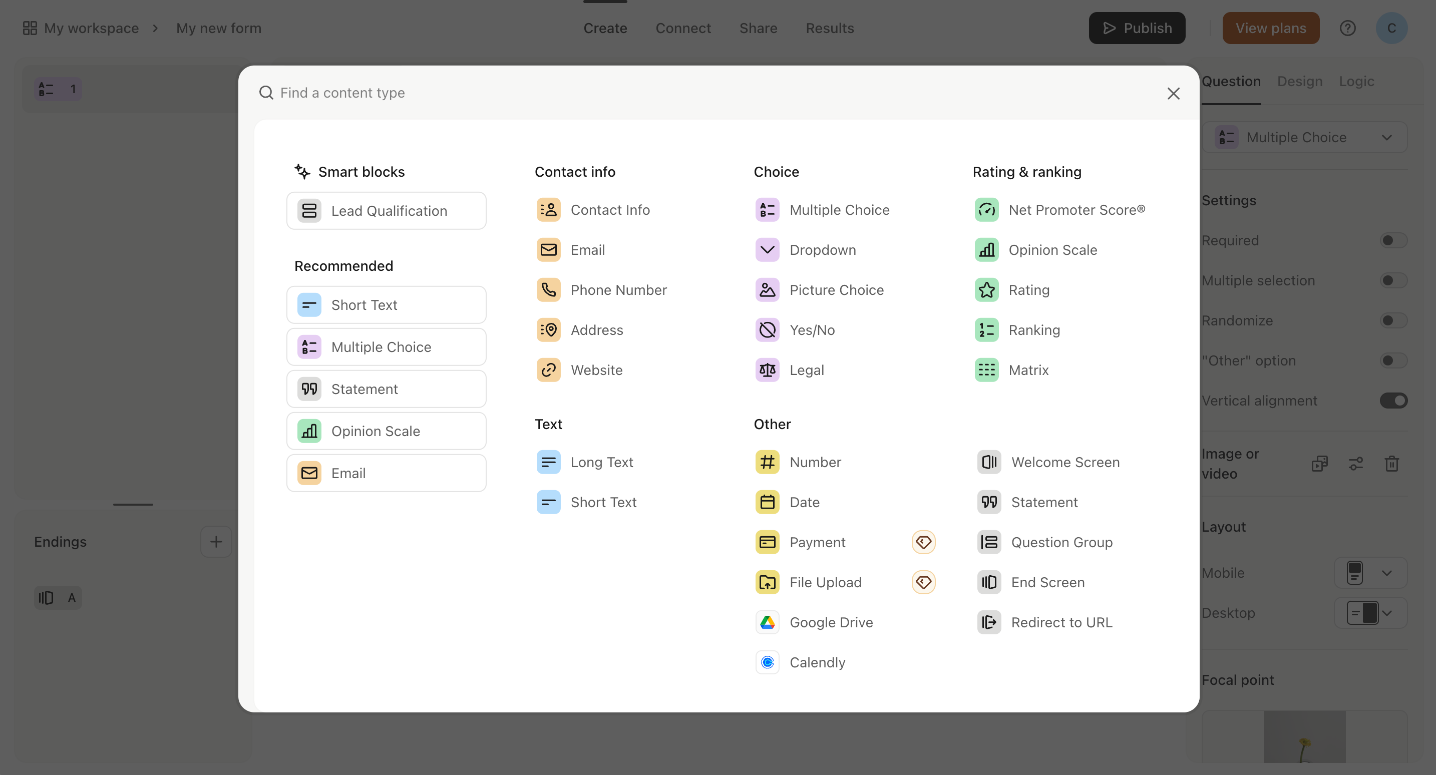
You’ll also see the new + Add content button which you can use to insert new questions into your form. We’ve made a few changes to the layout here to help you quickly find the right block.
We’ve moved Settings into the new toolbar. Click the gear to open the modal where you’ll find more options including adding follow-ups to your typeform.
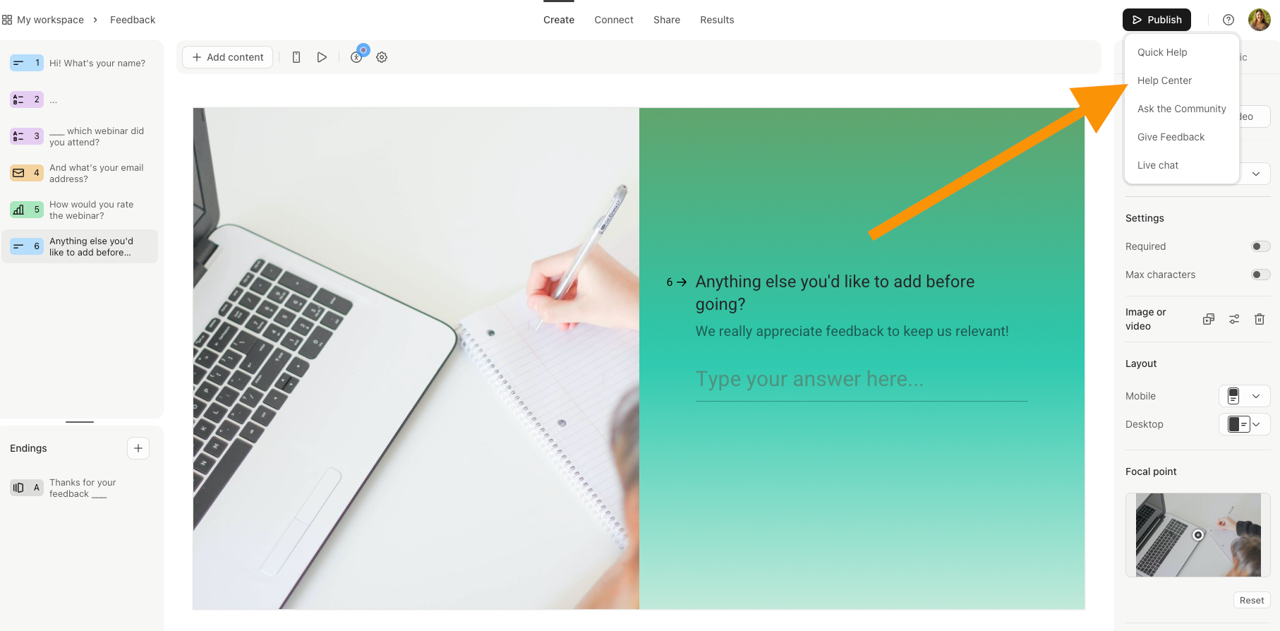
And there’s a new position for the Help icon - it’s moving to the top right corner next to the user icon. Click the ? to access the drop down list of options:
We hope you like the new design, we think this layout is going to make creating typeforms even easier! And if you need a little more help finding your way around the builder you can always check our Getting started with Typeform guide.
Let us know what you think of the glow up, and if you have any questions drop them in the comments! ⬇

