Question

Changes on Mobile Layout vs. desktop layout


Userlevel 3

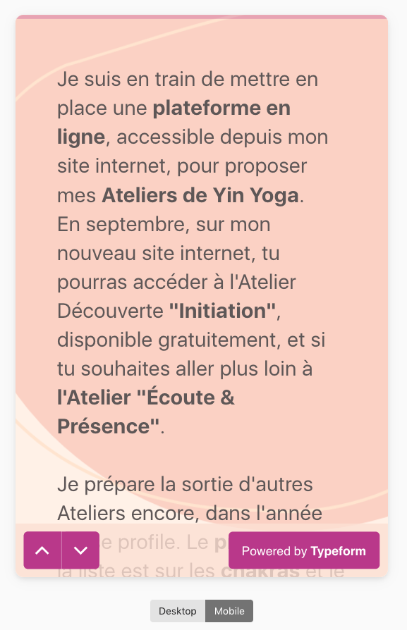
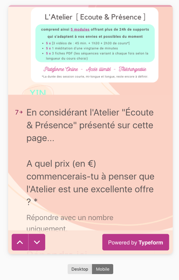
Is it possible to change the layout of the mobile version directly, independently of the layout of the desktop version? 

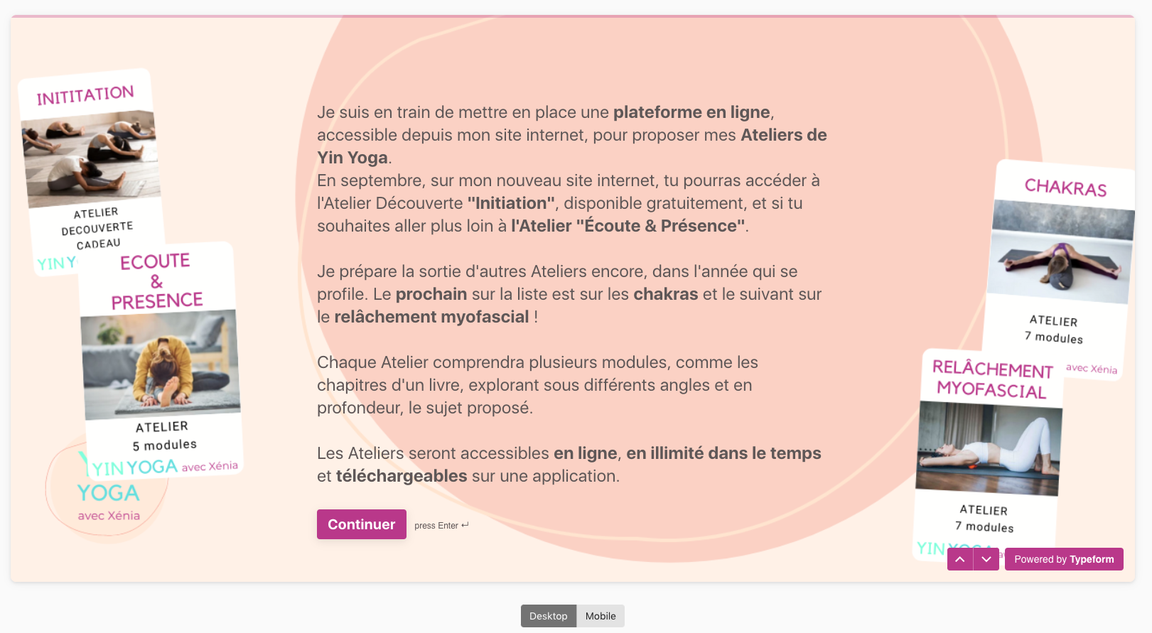
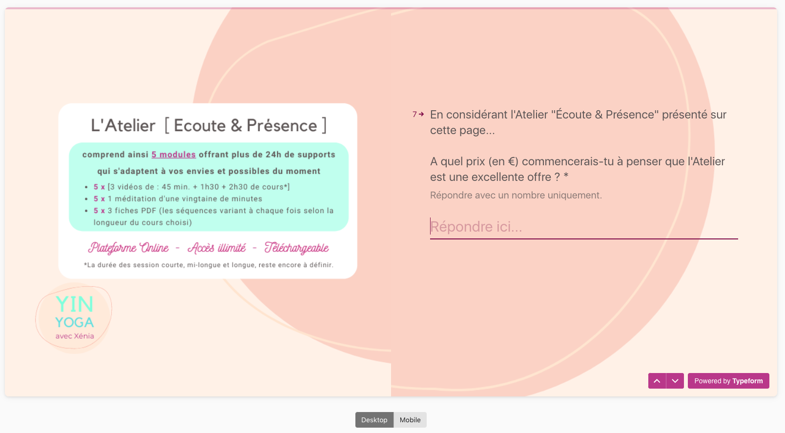
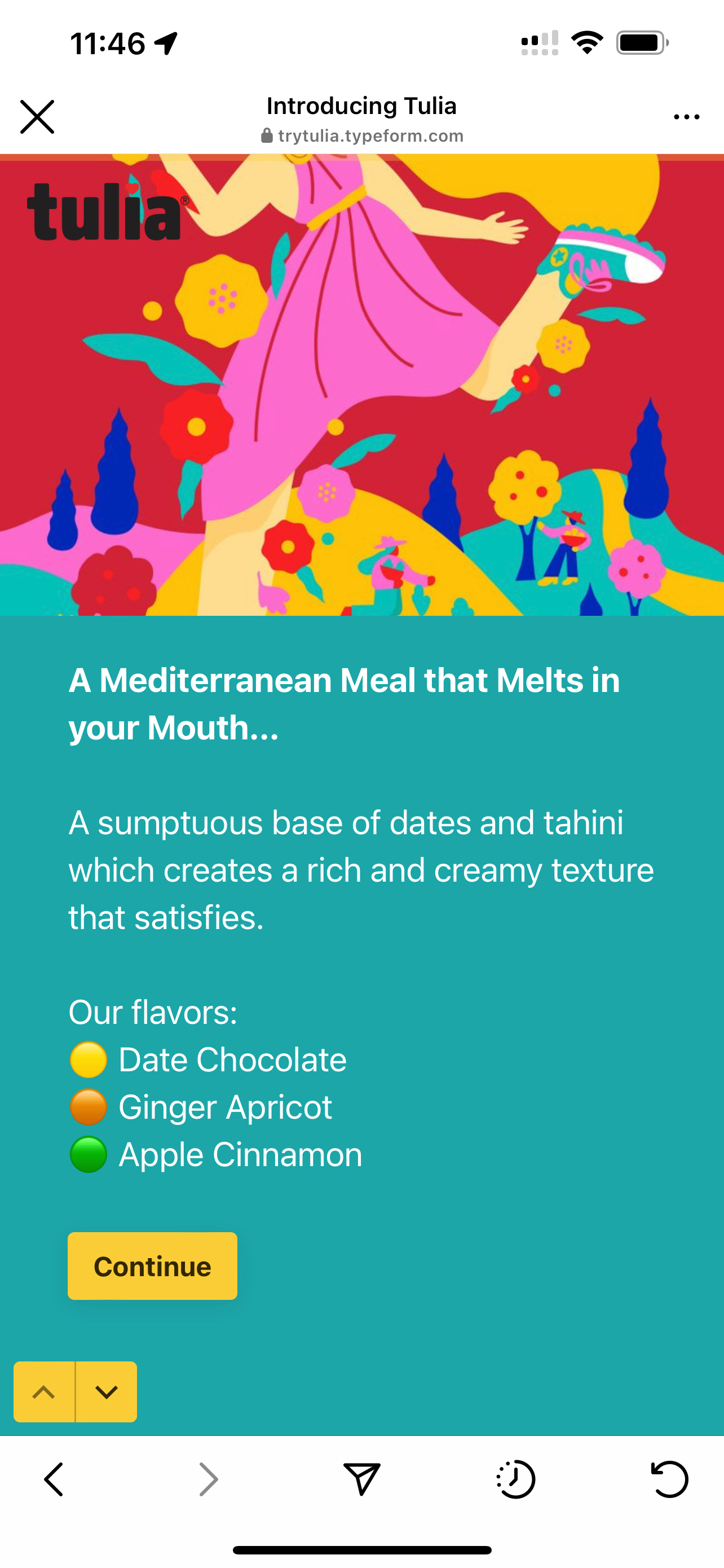
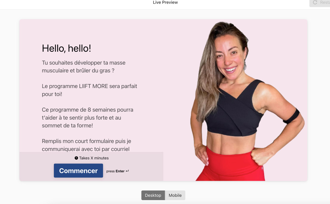
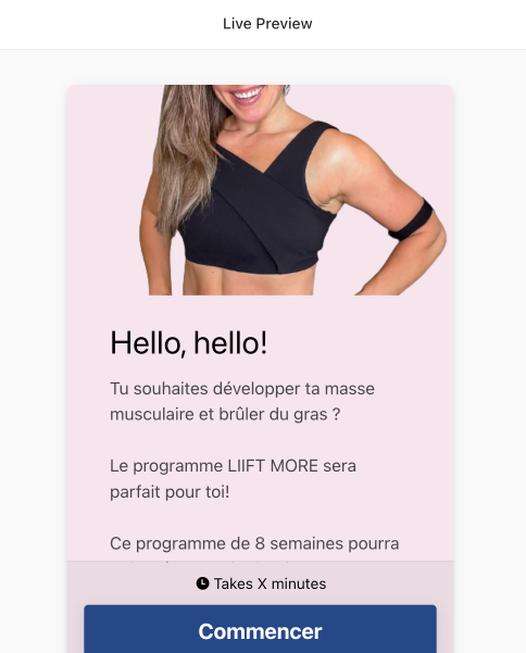
I have images that summarize my offer, that displays very well on the desktop version, and that do not render well at all on the mobile version. I wish I could place them differently for the mobile version.


39 replies

Userlevel 7
Badge +5

Hi @Xeniouska Thanks for stopping by the community, and happy Monday! :grin: We don’t have this feature yet, but this is a handy idea. Do you mind sharing your form/images and how they differ versus mobile/desktop so I can share this with the product team? Thanks!

Userlevel 3

Of course. 

Here my main disapointment is about the pictures, that I implemented on the whole background or on the left side. 

I also would like to be able to choose another size for the text.

Here are my screenshots of desktop layout

 vs. mobile layout  :


Userlevel 7
Badge +5

Thanks, @Xeniouska ! I’ve shared this with product. :grin: If this is something they consider to develop based on requests, I’ll keep you posted! 

Userlevel 2

Please add this functionality. It’s so needed. Have your development team think about website development. On virtually any modern platform, SquareSpace for example, you are able to create a separate layout for mobile vs desktop, as image cropping and text ALWAYS need to be adapted and optimized on desktop and mobile independently to optimize the experience. Your platform is great for surveys and our company is moving to use it exclusively, but this basic functionality is an absolute MUST. Especially considering people that are strong designers and want to leverage imagery and layout to create really well-designed, custom survey experiences for their audience. It’s impossible to do this with a horizontal (desktop) layout that is exactly the same and inextricably linked to a narrow, vertical layout (mobile). Not being able to create separate layouts for mobile and desktop with the same survey strongly compromises the power of your platform as both experiences end up being much, much more generic. You guys have to get this basic functionality built in. When a survey goes out, the platform should be smart enough to deliver a “mobile” version unique layout when someone is on their phone and a desktop version unique layout when someone is filling it out on a desktop web browser. That’s what SquareSpace on other website platforms do. Your development team doesn’t need to even go to the trouble to make it a dynamic design for layouts, just give people the simple capability to duplicate their survey and customize it separately for mobile, just as we can now duplicate an existing survey and customize it for a new survey. We just need that functionality at the desktop/mobile level to change cropping of photos, size of text, layout positioning, etc independently between mobile and desktop. THANK YOU!!!! This simple tweak will be a game changer and make the experience for those taking the survey a thousand times better.

Userlevel 7
Badge +5

Hi @Neil at Noun Ventures I’ve responded to your individual thread. Thanks for starting that! :grinning:

Of course. 

Here my main disapointment is about the pictures, that I implemented on the whole background or on the left side. 

I also would like to be able to choose another size for the text.

Here are my screenshots of desktop layout

 vs. mobile layout  :


Similarly here’s my form on mobile


Here it is on desktop :\


Userlevel 7
Badge +5

Oh, thank you @BlueCamel . This helps a lot, and I see what you’re referencing in regards to the images now. I’ve shared this with the product team, and if you have anything else you’d like them to see, send it over! :grinning:

Damn I wish this feature was out by now

Yes designing for mobiles is a must have !

Come on product team, we need this ! 🙏🏽🙏🏽🙏🏽

Yes right. I don’t understand why this is not implemented yet. 

Major downer. Any implementation date for this? @Liz 

Just to add to this thread with a plea for this functionality! 


I designed a background image for clients to know how far through the survey they are, and it just doesn’t work at all when on mobile… I am considering trying to make a version where the dots are vertical along the right side in order to configure more with the mobile sizing, but again I’m not sure if this would work on both desktop and mobile. 


Please update ASAP! 


Userlevel 7
Badge +5

Hi @VentureEducation oh, this is a really interesting use case. Thanks for the photos! It helps illustrate why this feature would be important. 😀

Here is my example:

This looks perfect on desktop but cut off on mobile. 


Userlevel 7
Badge +5

Hi @Kole thank you! I appreciate it. 😁

Userlevel 1

Here’s another example of this issue 


Going to leave the subscription because of it. It should be mobile first anyways. No brainer

Userlevel 7
Badge +5

Hi @ArturFI Thanks for stopping by! We completely understand if you need to find another service that fits your needs better, and I’ll share this feedback with product. 

hi team, circling back on this request - we have a subscription and would highly highly appreciate working on this feature. every small email provider has this option already and makes the CX much better! do you guys have an ETA for it by chance? thank you!


Userlevel 7
Badge +5

Hi @josi Thanks for stopping by! This isn’t currently in the roadmap, but as always, keep an eye on the community in case that changes. 

+1 😎😎

Adding my upvote to this request! 

Here’s an outline for my post:

  1. THE BET – I get 1,000 “likes” in 1 month from paying customers, you ship product.
  2. THE CONTEXT – Me bragging about how connected I am with thousands of Founders.
  3. THE MANSPLAIN – Me explaining to you why you should have shipped this a year ago. And I am a man.
  4. PRODUCTIVE SOLVES – My form / how I have hacked around this missing feature (great for other members!!). HERE is my form – also linked below.

THE BET:
 

Let the data talk. I bet I can get 100 upvotes on this comment. I will do it in 30 days if you commit in writing that you will ship an MVP feature for a desktop / mobile layout split by Sept 1st, 2023. Bring this up in stand up tomorrow. It will amuse the team. If you reply with a “yes”, good job, you know how iterate product around customer feedback (at scale). If no, why? And, also, I will just skip the “cute community” step and email the people who actually can shape product decisions – like, I don’t know, Oji. Or...Julie Kim who’s email uses her real name, Joori 👻.
 

@Liz just shot you a text, too, so you know my tech muscles are bigger than your average community member 💪🏻💪🏻💪🏻.


THE CONTEXT:


I run a company which pairs photographers with brands. It’s pretty big. We have 42,000+ photographers and...we’ve shot for over 5,000 brands. I know many of them, personally. And have advised, consulted for, or invested in dozens and dozens of companies that use your product. I would bet (I guess I already did 🤣) I could get 10% of the ~1000 that have an active type form subscription to upvote this week. Just say “go” 🏁.


THE MANSPLAIN:


As you know @Liz having worked at Uber and now Typeform...you are part of a much larger trend. A modernization of the web whereby third party tools – from CMS tools like Squarespace or Shopify, to Canva, to Stripe, and more – can stand alone OR be wired together / into custom software. By stacking products like this together, anyone with an internet connection can build a company or idea in weeks (days if you know what you are doing).


I just ripped out our “Job Post Flow” – build in React and Node.Js – which we have had in place for 4+ years and replaced it with Typeform. I did this so I can adapt to data (using Fullstory) and remove friction to enable more jobs to be posted for our photographers vis a vis our site traffic. This is a massive statement. I ripped out something that cost me ~$250,000 to build in man hours and replaced it with THIS FORM which I built in 12 hours this weekend, by myself, using Canva.


You and your product team are aware of this trend, Liz. Typeform is the at the epicenter of modern web development which then naturally begs the question: why don’t give your users the ability to optimize for web and mobile, the ratio of traffic tilting, obviously, towards the latter more and more?


PRODUCTIVE SOLVES:


HERE is my form. Below find a list of “hacks” mostly using Canva (which I highly recommend) to get around your product limitations.

  • More design flexibility. Fonts, multiple graphics per page, graphics NOT in the center of the screen (but at the bottom or top), etc.
     
    • I recommend using various templates in Canva. For me I made a Canva project with 1600 x 1800 px for half page graphics (on each page) and 1000 x 1000 px for icons and “photo multiple choice” questions.
       
    • I also recommend making “videos” in Canva. They have tons of templates with pre-made motion that’s super slick. You can export as a high resolution 1080 or more MP4 video. Then, convert the MP4 to a GIF online (just google “MP4 to GIF converter) play around with the settings (600px max, 12-20 frames per second max, etc) so that it’s under the 4MB limit that Typeform has). Do this, and your pages will COME ALIVE.
       
  • I wanted a progress bar with more info. I got inspired and made it a growing discount code (+1% per question).
     
    • Check out the cute “pig” I added. If you’re on your phone YOU CAN’T BECAUSE IT’S CUT OFF!!!! AGH!!! If you are on your computer, though, you’ll see it. I created a playful animation in Canva using a GIF (the pig), yellow squares (and altering the “transparency”, and adding animations to make the pig move.
       
  • I wanted a way to SKIP to the end so if and when people get bored / tired / stumped, they can complete the form.
     
    • I added instructions for how to SKIP in the secondary font on the form. Working on a better solve and will update this thread. Booooo.


Anyway, hope you bring this up in stand up tomorrow Liz. And hope this was helpful (or at least mildly entertaining) to others including @Xeniouska  @BlueCamel @karethic @Gabi Amaral @marinam @VentureEducation @Ondiek @chargeguru @lholz171 @surveyor @Neil at Noun Ventures @Akshay125 @josi @Roaldus @qanlex @ArturFI @Kole @emilierobidas @SebasDogin1.


You can email me at james@thehhub.com if you want to brainstorm or share ways you’ve worked around the roadblock. Or comment on this post.


Let’s get this done, team.

James (@jamesgriffincole).


Adding to this thread. This functionality is so needed! Please send this to product again for review!

very very needed

Reply