

Hi all,
Hope someone can help. I tried so many different ways of getting what I want but cant and am feeling quite frustrated.
I’m trying to make it so that I can change the width of the embeded Standard typeform on my website anytime on the Share>Design settings.
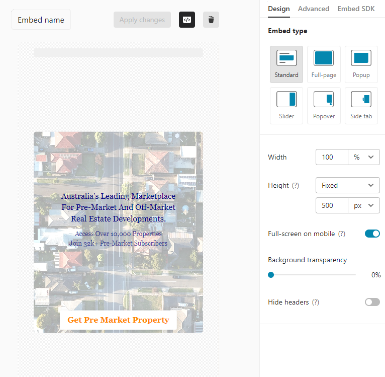
However, I want to adjust width in px. The reason it is in % above is because I notice that 100% is the only way that the typeform will properly format on a mobile.
If I were to enter in 1000px which is what I want on a desktop, the typeform would over extend the typeform and break the mobile width.
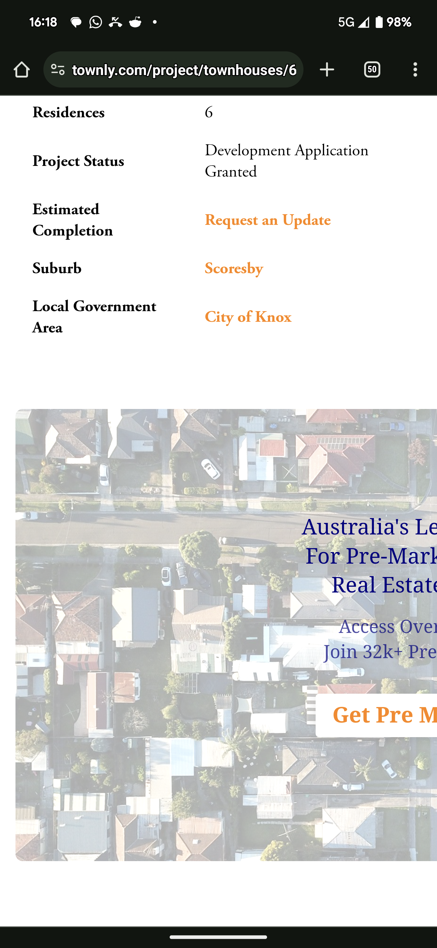
What I want is to be able to adjust the typeform in Share>Design in px because there may be times that I want to change the width for desktop for the same typeform. I also want to be able to lock the width on the mobile format to 100%.
I don’t know coding so is there a way to add code to the embeded code to target mobile formatting?
style="mobilewidth:100%”
OR
data-tf-something??
