I want to create a personality test which classify one’s personality in a four-coloured spectrum. For that, I always list four adjectives and ask the participant to rank the adjectives from 1-4. (1 = most accurate; 4 = least accurate). Each adjective can be ascribed to one of the four personalities. In the end, each personality (colour) has a specific score.
I.e
ambitous (red) 2
analytic (blue) 1
social (yellow) 4
pleasing (green) 3
…
Total yellow: 40
Total blue: 37
Tot red: 30
Total green 17
Ending:
You are a rather “yellow” person but you also have blue characteristics…
I always fail when trying to depict the answers all together in a spectrum rather than in a linear result since all combinations of personalities are possible.
I hope someone can help me with my rather complex topic. Thanks a lot!
Best answer by James
Hey @Dentimon ,
This sounds like an interesting one, and potentially very useful if you can get it right.
I think using a ranking question will make this more complicated (if not impossible) since Typeform doesn't support logic for ranking questions. An easier way to do it would be to use an Opinion or a Rating question to record their "score" for each attribute – you could block these out into question groups to make it easier on the respondent.
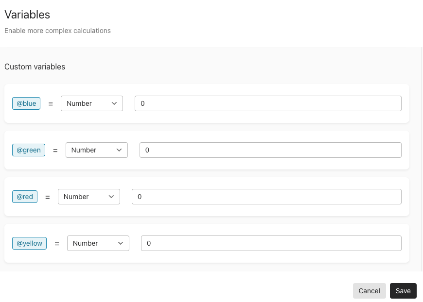
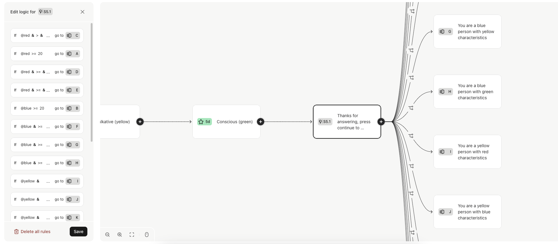
You can then create a variable to record a running score for each of the colours. Create a custom variable for each colour…
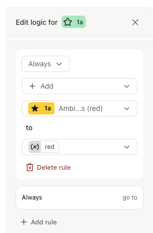
…then add the colour's rating to that colour's variable:
Do this for all of the questions and all of the colours.
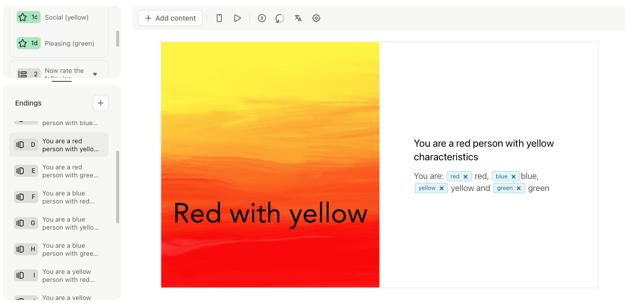
Then you can set up a series of different endings for the different spectrum options. I'd stick to a combo of two colours max or it could get really complicated. So for example, make different endings for:
A red person, blue person, yellow person, green person, red with blue, red with yellow, red with green, blue with red, blue with yellow, etc…
(you could make graphics for each one using Canva or similar)
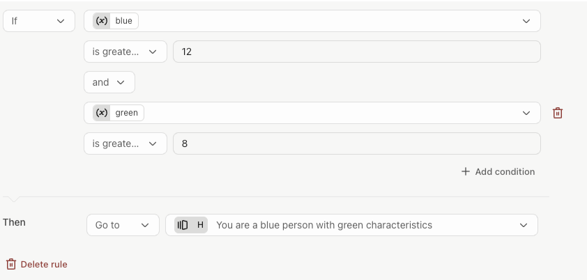
Now you need to apply the logic to redirect to the appropriate ending screen based on the total scores of the red, blue, yellow and green variables. The logic rules will obviously depend on how many questions you have.
Obviously the logic when one colour has the max score each time will be easy – i.e if there are 5 questions and four colours, a score of 20 would redirect to the red, blue, yellow, or green ending. I'm not a maths expert sadly so I'm not sure exactly how you'd calculate the two colour endings. I guess it would be something like this, but will depend on the number of questions you have (in this case it would mean blue has been chosen 3 times and green twice – assuming there are five questions)
I appreciate this isn't a full solution since the logic calculations are probably the most complex part. But hopefully it's a start. Maybe others have some suggestions of how to expand on this, or if there's an easier way around this…
This sounds like an interesting one, and potentially very useful if you can get it right.
I think using a ranking question will make this more complicated (if not impossible) since Typeform doesn't support logic for ranking questions. An easier way to do it would be to use an Opinion or a Rating question to record their "score" for each attribute – you could block these out into question groups to make it easier on the respondent.
You can then create a variable to record a running score for each of the colours. Create a custom variable for each colour…
…then add the colour's rating to that colour's variable:
Do this for all of the questions and all of the colours.
Then you can set up a series of different endings for the different spectrum options. I'd stick to a combo of two colours max or it could get really complicated. So for example, make different endings for:
A red person, blue person, yellow person, green person, red with blue, red with yellow, red with green, blue with red, blue with yellow, etc…
(you could make graphics for each one using Canva or similar)
Now you need to apply the logic to redirect to the appropriate ending screen based on the total scores of the red, blue, yellow and green variables. The logic rules will obviously depend on how many questions you have.
Obviously the logic when one colour has the max score each time will be easy – i.e if there are 5 questions and four colours, a score of 20 would redirect to the red, blue, yellow, or green ending. I'm not a maths expert sadly so I'm not sure exactly how you'd calculate the two colour endings. I guess it would be something like this, but will depend on the number of questions you have (in this case it would mean blue has been chosen 3 times and green twice – assuming there are five questions)
I appreciate this isn't a full solution since the logic calculations are probably the most complex part. But hopefully it's a start. Maybe others have some suggestions of how to expand on this, or if there's an easier way around this…
@Dentimon@James@Grace - you could also use a ‘radar’ chart in Google Sheets to depict the results. - i know this is not a colour spectrum per se but you can play with the formatting of the output template ‘behind the chart’ to show a spectrum of colours.
I know i did a post in the Community about this back in mid-Nov but i can’t seem to find it in the search feature, so here is part of it from a blog post i created:
How to create a ‘radar’ chart in Google Sheets for a report - based on Typeform submission. Or any other graph that is.
Here’s the use case - or at least one of them:
You are using a scoring quiz to evaluate some aspect of the respondent and want to show a graph of the output. Say, 5 categories of an assessment or something similar.
You want to send them a customized document after they submit their data, complete with a graph of the results.
Here’s the toolset:
Typeform
Google Sheets
Document Studio (yeah that one again, lol)
the blog post has a Google Doc and a link to a video in it that show how you can do this.
@James - if you can find the link to the Community post using your magic wand, please share!
Until then, here’s the link to the blog post with the details.
Genius suggestion @john.desborough - I love the idea of emailing a custom report using this method. As you say, it should be easy enough (hopefully!) to switch the radar charts for spectrum graphics and follow the same method.
I waggled my wand and managed to find your (incredible) guide here:
@Dentimon I reckon des’ solution above can help you make this happen! Let us know what you think...
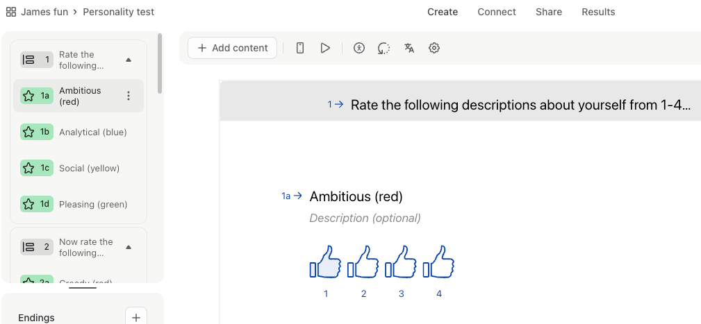
Thank you @john.desborough ! Is it somehow possible to show all four rating question on one slide so that the respondant can still compare each attribute of one group with one another?
Unfortunately, I wasn´t able to fully understand how I can depict the slide as wanted. Could you. explain to me how you meant it? My goals is so to have on question i.e. “
Please rate how the following adjectives fit your personality and give it a thumbs up. You can only award each number of thumbs once per round.
And then the four adjectives with a rating below each of the four words…