As you can see on the screenshots, I have a problem with my typeform on mobile, the form is displayed correctly before you start the form, but then you can see that the size change and it overflows on the right outside the margins. I use a wordpress website with Divi.
Thanks for your help.
Best answer by mathio-tf
You are overriding our default CSS and that broke your embed:
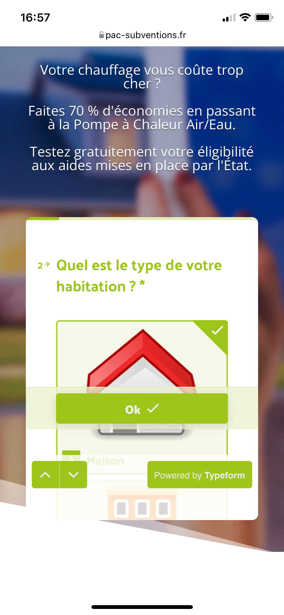
Thanks it worked, but now I have an other issue, as you can see on the screen the “OK” button is appears on the middle of the screen, any way to correct this please ?
Thanks it worked, but now I have an other issue, as you can see on the screen the “OK” button is appears on the middle of the screen, any way to correct this please ?
Thanks
Hello mathio,
Is there a way to remove this OK button in the middle of the screen on mobile?
However it seems like there might be some issue with the alignment and position of that button. Can you please share URL of the page with your typeform? I will have a look.
However it seems like there might be some issue with the alignment and position of that button. Can you please share URL of the page with your typeform? I will have a look.
Also, before embedding I selected the “full screen on mobile” option, but it doesn’t come up as full screen on mobile. The code is: <div data-tf-widget="MRUN08lq" data-tf-opacity="100" data-tf-iframe-props="title=Mini planas" data-tf-transitive-search-params data-tf-disable-scroll data-tf-auto-resize data-tf-medium="snippet" style="width:100%;height:600px;"></div><script src="//embed.typeform.com/next/embed.js"></script>
I (or someone else from the responsible team) will get back to you on the “OK” button.
As for the “full screen on mobile” option - I see you are not placing the embed code directly into your website, but it is wrapped inside another <iframe> tag:
If you do this, the typeform will be always constrained inside this iframe. When it tries to open in a popup and resize to full screen it is limited to the size of this iframe and will not cover the rest of the page. If you can place the code directly into your page, not the iframe, it should work as expected.
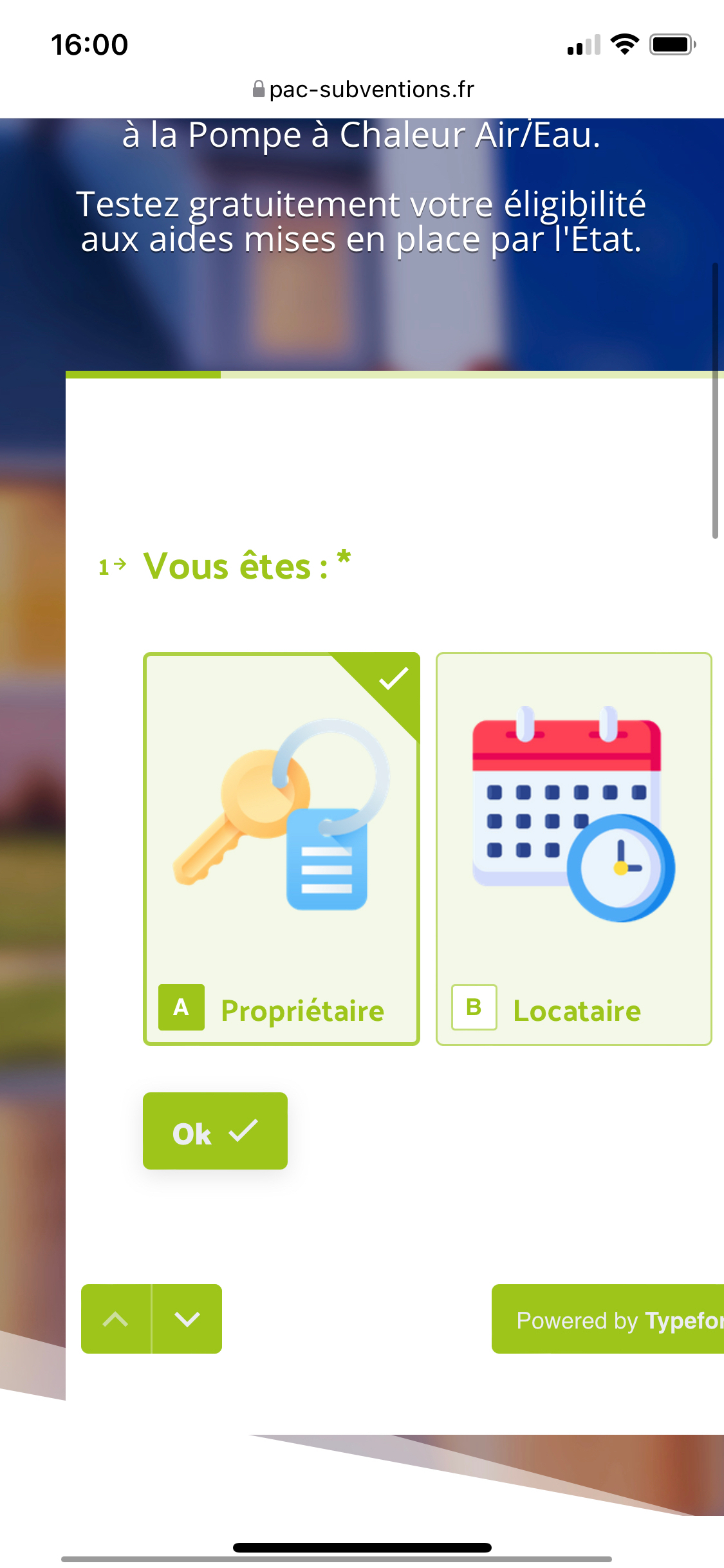
Hi, I was told by the respective team (and I also confirmed on iPhone) that the “OK” button position was just fixed.
I’ve just dev tested my first Typeform survey and I’m still getting the “OK” button appearing on iPhones using both Chrome and Safari (those I’ve tested). My test responses do require a scroll down to be able to see/select some options. Most of my multiple choice questions only have single choice and the survey is automatically moving forward to the next question. Is there anything specific I need to change to remove this OK button?


