Answered

Typeform embed in Webflow

  • 3 February 2022
  • 10 replies
  • 833 views

Userlevel 3
Badge +1

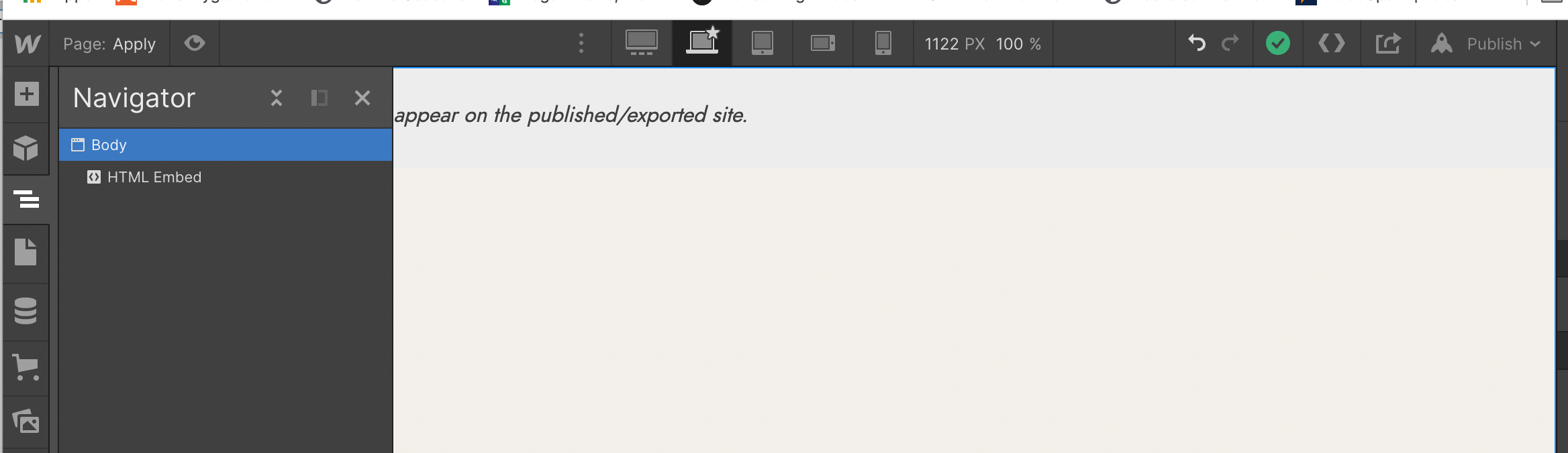
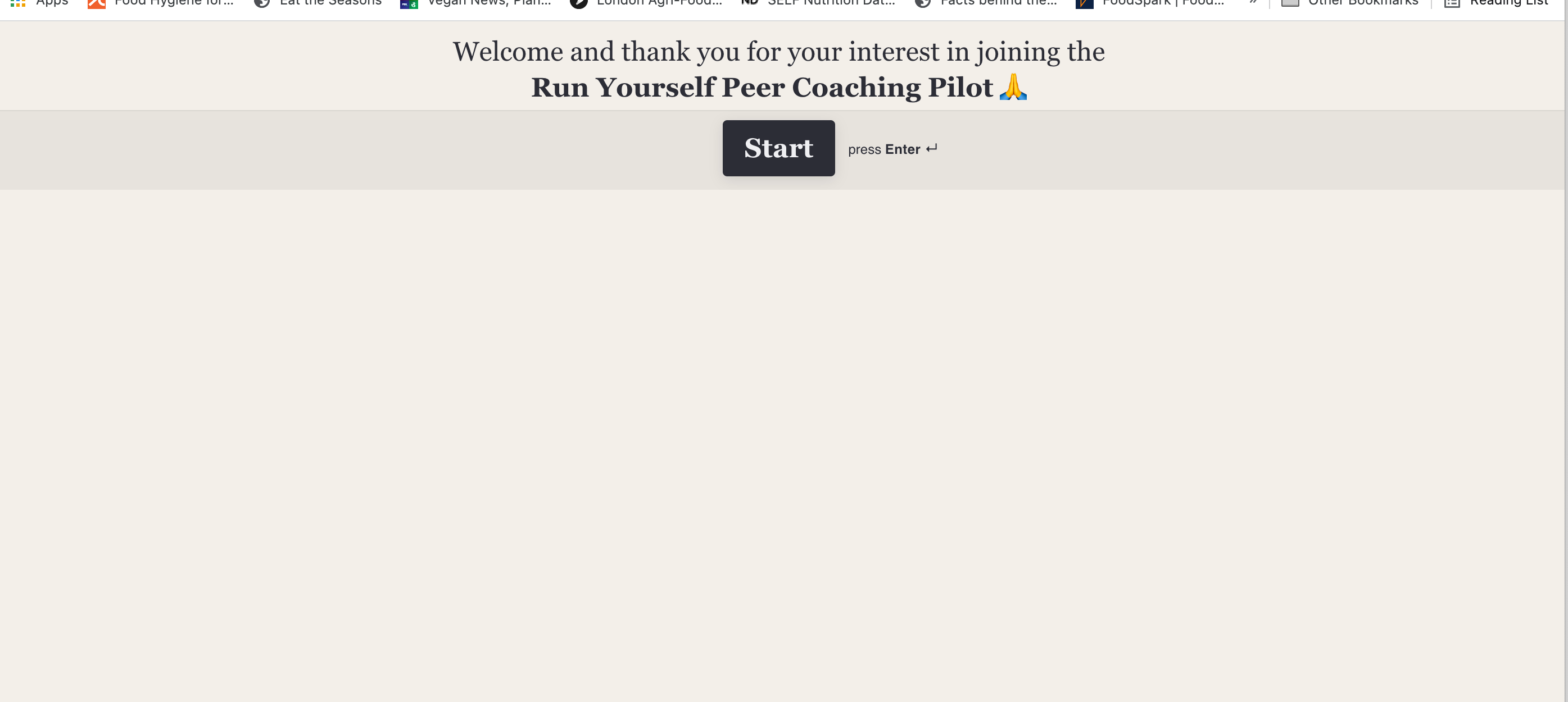
Hello there! I have an issue with embedding Typeform as full page in Webflow. For some reason it gets squeezed at the top. https://www.runyourself.co/apply

Why is this the case? Many thanks!


icon

Best answer by mathio 3 February 2022, 20:27

View original

10 replies

Userlevel 7
Badge +5

Hello @Mica 

the default full-page embed code is intended to be used as the only content in your HTML page. Since your page contains other elements, you need to properly size the parent element of your embedded typeform.

This is the parent element in your case:

<div class="w-embed w-script">...</div>

You can set the height via CSS, eg. like this (note that 77px is the height of your page header):

<div class="w-embed w-script" style="height:calc(100%-77px)>...</div>

Userlevel 3
Badge +1

@mathio thanks for this – I’m not highly technical 😁so I did not understand what you said. Would you be so kind as to help me? What do I need to change in the code that I have currently:

<!DOCTYPE html> <html lang="en"> <head> <meta charset="utf-8" /> <meta name="viewport" content="width=device-width, initial-scale=1" /> <title>Run Yourself Application</title> <style>*{margin:0;padding:0;} html,body,#wrapper{width:100%;height:100%;} iframe{border-radius:0 !important;}</style> </head> <body> <div id="wrapper" data-tf-widget="lxbSOhGg" data-tf-inline-on-mobile data-tf-medium="snippet" ></div> <script src="//embed.typeform.com/next/embed.js"></script> </body> </html>


Thank you!

Userlevel 3
Badge +1

@mathio also I removed ALL the other elements - there is nothing else there

… and the issue still persists:


Userlevel 7
Badge +5

I am sorry but I dont have experience with Webflow. What you need to do is set height of the parent HTML element of your embed (I believe Webflow will wrap your embed code in another element, even if not visible with naked eye). On the left side of your screenshot I see “Body” - maybe you can set height there?

Userlevel 3
Badge +1

Thank you so so much @mathio - managed to fix it!

Userlevel 7
Badge +5

Thats awesome @Mica ! If I may a small suggestion - I see you set the height to 100vh, which causes your page to scroll and hide the start button. If you are able to set the height value manually, try setting it to calc(100vh - 77px).

Userlevel 7
Badge +5

Hey @Mica! How are you doing today? Can you show us, in details, how you managed to fix this? Very curious to know! :wink:

Userlevel 3
Badge +1

@Gabi Amaral I simply changed the custom code to specify the height (see bold below):


<!DOCTYPE html> <html lang="en"> <head> <meta charset="utf-8" /> <meta name="viewport" content="width=device-width, initial-scale=1" /> <title>Run Yourself Application</title> <style>*{margin:0;padding:0;} html,body,#wrapper{width:100%;height:100vh;} iframe{border-radius:0 !important;}</style> </head> <body> <div id="wrapper" data-tf-widget="lxbSOhGg" data-tf-inline-on-mobile data-tf-medium="snippet" ></div> <script src="//embed.typeform.com/next/embed.js"></script> </body> </html>

@mathio thank you! That worked too!

Userlevel 3
Badge +1

@mathio any thoughts on what height I might be able to use for mobile? Desktop seems to work, but mobile seems to be an issue :(

Many thanks!

Userlevel 7
Badge +5

Hello @Mica 

this is a common issue because browsers consider the whole browser window as 100% height however they also cover parts of it with toolbars (that disappear later as you scroll). 

One way to fix this is to set your wrapper height via JavaScript:

<script>
const wrapper = document.querySelector('#wrapper')
const height = window.innerHeight - 77
wrapper.style.height = `${height}px`
</script>

If you want a CSS-only fix, this will work for Safari-only (iPhone):

<style>
height: 100vh;
height: -webkit-fill-available;
</style>


Reply