



We’ve updated the colors in a selection of our form themes to improve contrast and make questions, answers, and buttons easier to read. These small design changes are part of making forms more accessible to people with visual impairments.
If your form uses one of the themes below, the updates have already been applied—there’s nothing you need to do.
Here’s why contrast matters and what’s changed.
Why is color contrast important?
Color contrast is important because text and background colors can determine how people interact with the content that is written in those colors. Low contrast colors are difficult to read when text contrasts poorly with background colors, while high-contrast colors are easier to read when paired together.
According to the UK’s National Health Service (NHS), 1 in 12 men and 1 in 200 women have a color vision deficiency. Color deficiency reduces a person’s ability to distinguish between the different shades of yellow, red, and green. This means that they may only be able to tell there is a difference in color and perceive text if it has high contrast.
(source)
What’s changed?
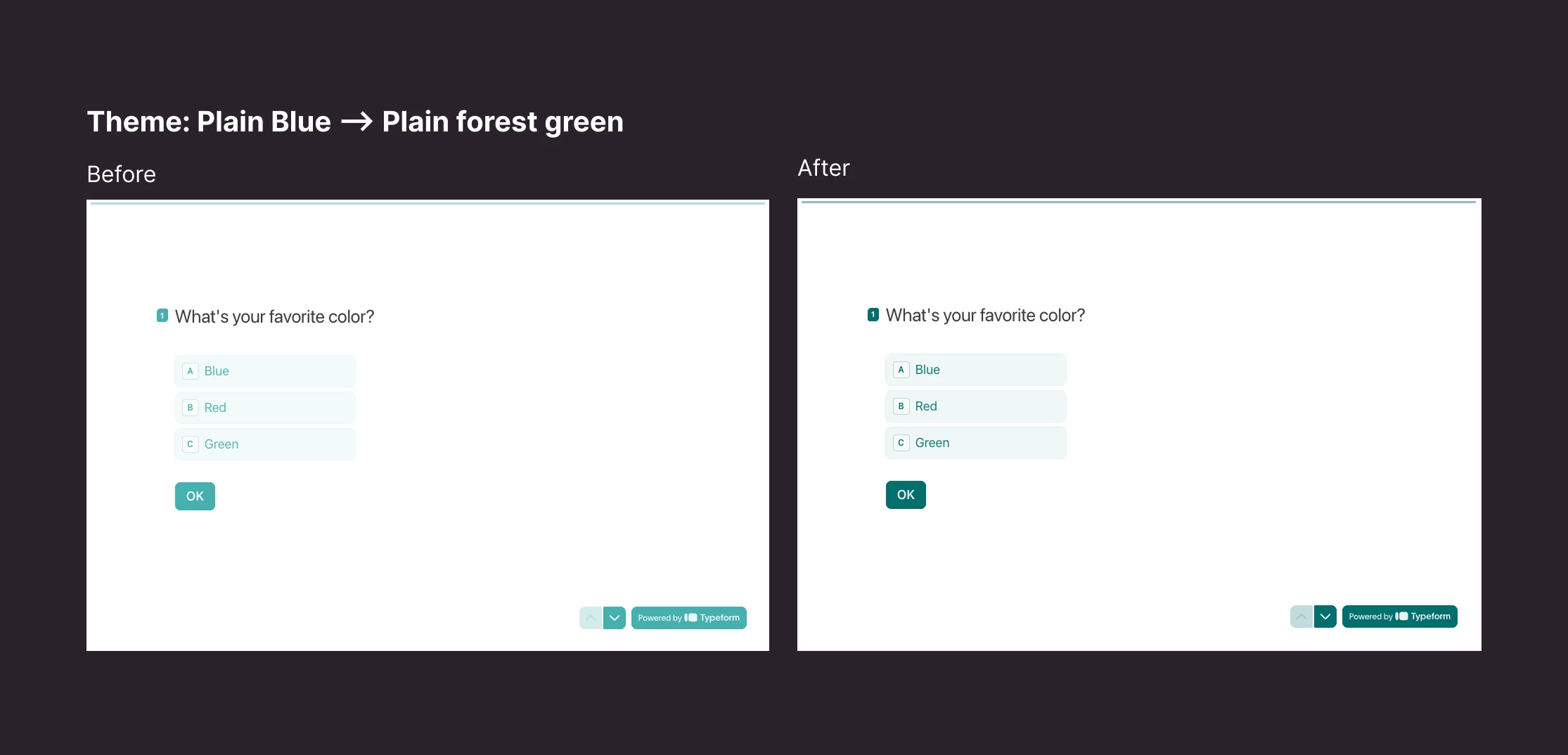
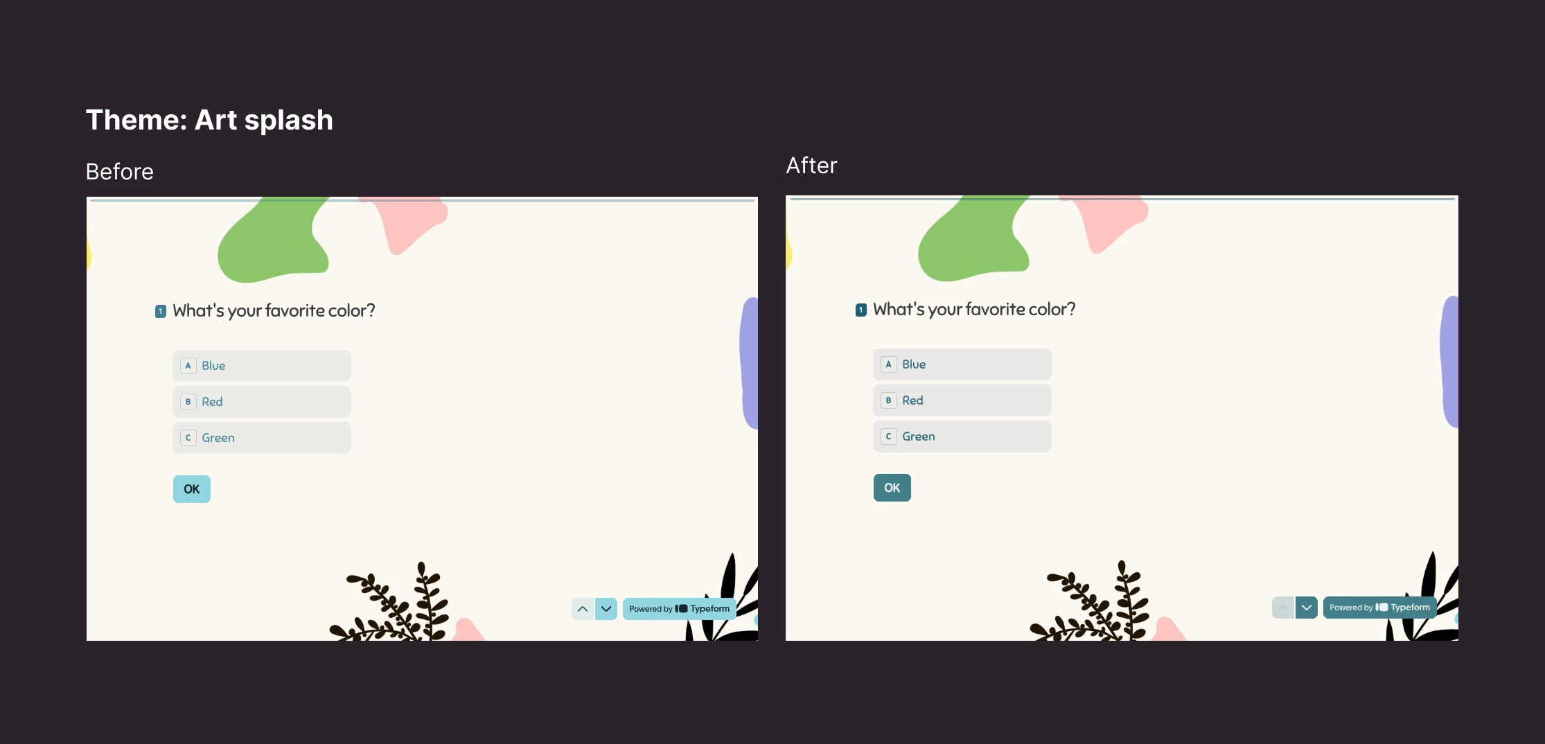
Most of the color adjustments are subtle. The changes to Plain blue (now called Plain forest green) and Art splash are more noticeable, so we’ve included images alongside their details below. You’ll also find the exact color changes for the other updated themes:
Plain blue → Plain forest green
We’ve renamed this theme to reflect its updated colors.
- Answer and button background colors changed from
#4FB0AEto#166E6C.
Art splash
- Answer color changed from
#437E93to#276074 - Button background color changed from
#97D5E2to#477E89
Paper invite
- Answer color changed from
#C44665to#9D2643
Spaceboy
- Answer color changed from
#407FD4to#5D9EF5
Plain raspberry
- Answer color changed from
#C75875to#A73F5B
Techie
- Answer color changed from
#7E7E7Eto#5B5B5B. - Button text color is now explicitly set to white (
#FFFFFF).
Small changes, easier-to-read forms
These updates help more people read and interact with your forms. If you’re using one of the themes listed above, you can see the changes in your form now - no action is needed on your part.
Thanks for helping us make forms more welcoming to everyone. If you have questions or feedback about the updated themes, we’d love to hear from you 😊