Seeking Feedback: Improving Our Form to Capture Visitor Info

  • 13 May 2024
  • 3 replies
  • 42 views

Hey Typeform Community!


We are reaching out to seek your feedback and insights on improving our form to better capture visitor info on our landing pages.


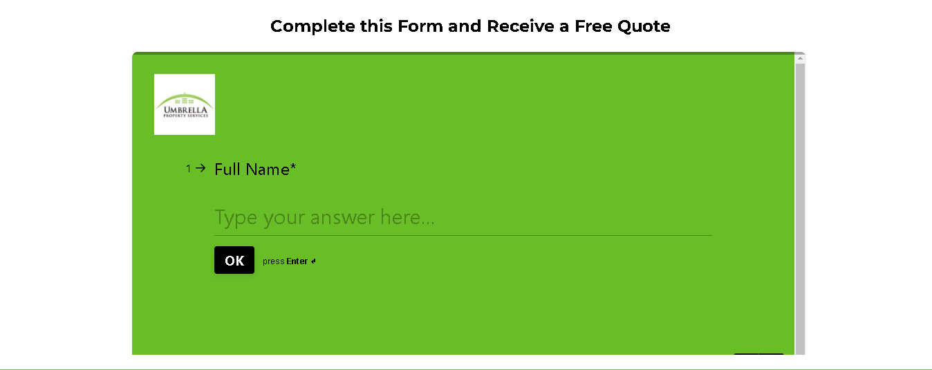
Here is one of our landing pages: Umbrella Services CA


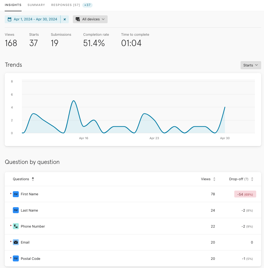
Lately, we noticed a concerning trend with our form's performance, experiencing a significant 54% drop-off rate. ☹️ Needless to say, we were disappointed, but we are determined to turn things around and improve the user experience!


We'd love to hear your thoughts and suggestions on how we can improve our form. Whether it's simplifying the layout, adjusting the fields, refining the language, or anything else you think might help, we are open to all ideas!


Please take a moment to review our current form setup and share your thoughts with us. Your feedback is incredibly helpful to us, and we appreciate any suggestions you can offer.


Our Current Form:


Thank you in advance for taking the time to help us improve + we look forward to reading your feedback & suggestions!


3 replies

Userlevel 7
Badge +5

Hey @GaeaKrishnan hope you don’t mind, but I moved your post to this new section of the community where we’re encouraging folks to ask for and give feedback on their typeforms 😊

We recently ran a workshop where we helped “tune-up” four different typeforms which you might like to watch back:

I’m sure some of the folks in the community would be happy to take a look at your form and offer some ideas - tagging @James @Liz @picsoung to get things started!

Userlevel 7
Badge +5

Hey @GaeaKrishnan James here from the Typeform Community team. Thanks for sharing what you’re working on, sorry to hear you’ve been disappointed by the results so far 😕

Just had a look at your form and also your web site, gonna throw a bunch of suggestions your way in case any of it is helpful:
 

  • Have you tested other types of web page embeds for your form? Perhaps a full page or a pop-up embed would encourage more people to start the form as there's less distraction on the page. One way to test could be to make a copy of the form and link to it in a new tab from the first  "Request a quote", then leave the existing form embedded further down the page. You could then compare the completion rates of each to give you an idea of whether people are more likely to complete when it's embedded in-line versus opening in a new tab.

  • I would recommend trying to make the form a little more conversational where possible. We've found that completion rates improve when you make the forms more like a conversation. So for example, even saying "Could we start by asking your name?" versus just "Full name" could make a difference. Alternatively you could bundle all of the contact questions into one page using the Contact Info question type and see if that makes a difference to form conversions.

  • When asking for personal details like phone number and email address it can help to explain what you'll need this info for. You could also assure them that you won't share  their data with third parties or send them marketing  – and if you will do either of these things then call it out (typeform has a ready-made legal disclaimer block you could use)
     

  • For "reason for inquiry" you could make this a multiple choice to make it easier for people to get the form complete. List some options then you can always add a final optional question saying "is there anything else you think we should know about your requirements?" You might even put this question first, to ease the burden on the respondent and start off with what they want. I'd say you could add an extra question to clarify the job and help you better create the quote (from a form filler's perspective if I'm filling in details for a quote I'd expect to have to answer a few questions about what I want).

  • Personally I love the color and the way you've branded it with the site, but might be worth experimenting with a whiter form (you could reuse the green for the buttons, for example)

  • Here's a webinar I recommend to folks who are looking to improve completion rates in general. It features form-creation insights from great minds like professor of conversation Elizabeth Stokoe, Community champion john desborough, and Typeform's Pol Barr. They explain some of the key best practices around designing successful lead capture forms. You'll definitely pick up some useful tips from that.


With all this in mind, I had a stab at a version of the form that might help to improve conversion rates and collect more data:


Just my humble take on it, I'm sure other people here have some bright ideas of what you might do! Hope it’s helpful. Happy to carry on workshopping if needed!


Userlevel 7
Badge +5

Hi @GaeaKrishnan I agree with everything James said above!

To go with the embed options, I would also suggest a pop-up, but I would also caution to test on mobile. Sometimes, a popup can look great on a desktop but not so great on mobile. 

If you use the suggestions above, let us know!

Reply