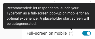
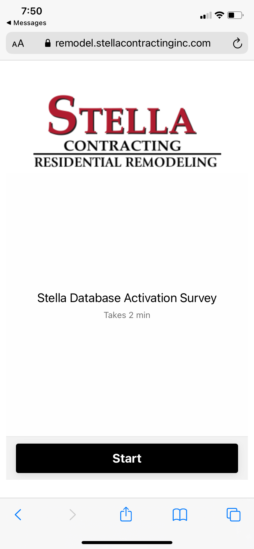
Why is this screen showing up on my survey when viewed on mobile? I have no welcome screen.
Th
anks

Why is this screen showing up on my survey when viewed on mobile? I have no welcome screen.
Th
anks
Best answer by mathio-tf
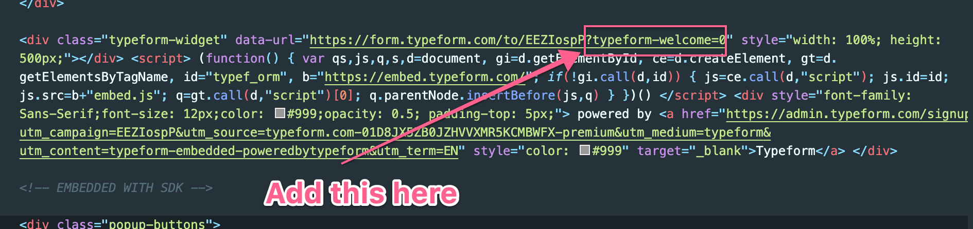
Hello
This should be the correct code:
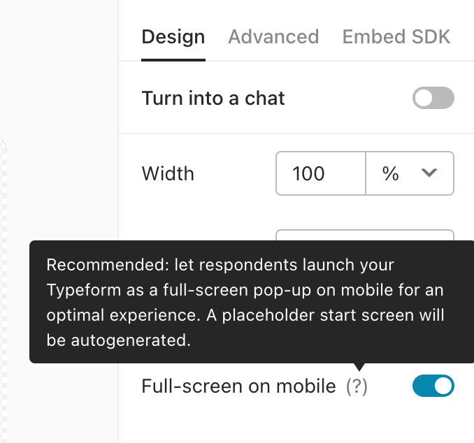
<div data-tf-widget="XXXXXXXX" data-tf-inline-on-mobile data-tf-hidden="utm_source={},utm_medium={},utm_campaign={}" data-tf-transitive-search-params="utm_source, utm_medium, utm_campaign" style="width:100%;height:500px;"></div><script src="//embed.typeform.com/next/embed.js"></script>
Enter your E-mail address. We'll send you an e-mail with instructions to reset your password.


