Is there a way to remove the floating “ok” button that pops up over a multiple choice question whose responses don’t fit entirely on a mobile screen? The button is distracting. I think people know that they need to scroll down. If they select an answer it will take them to the next question anyway. If this isn’t possible it should be a new feature.

Thank you.


Hi @Jack Thanks for stopping by the community! :) 

I believe this is normal behavior, but would you mind sending a screenshot/video of what you’re seeing? I just want to be sure we’re referencing the same thing! If you could also send the URL of the form, that’d be handy. 


Thanks for responding! The URL is: https://jlyndonfinancial.typeform.com/risktolerance

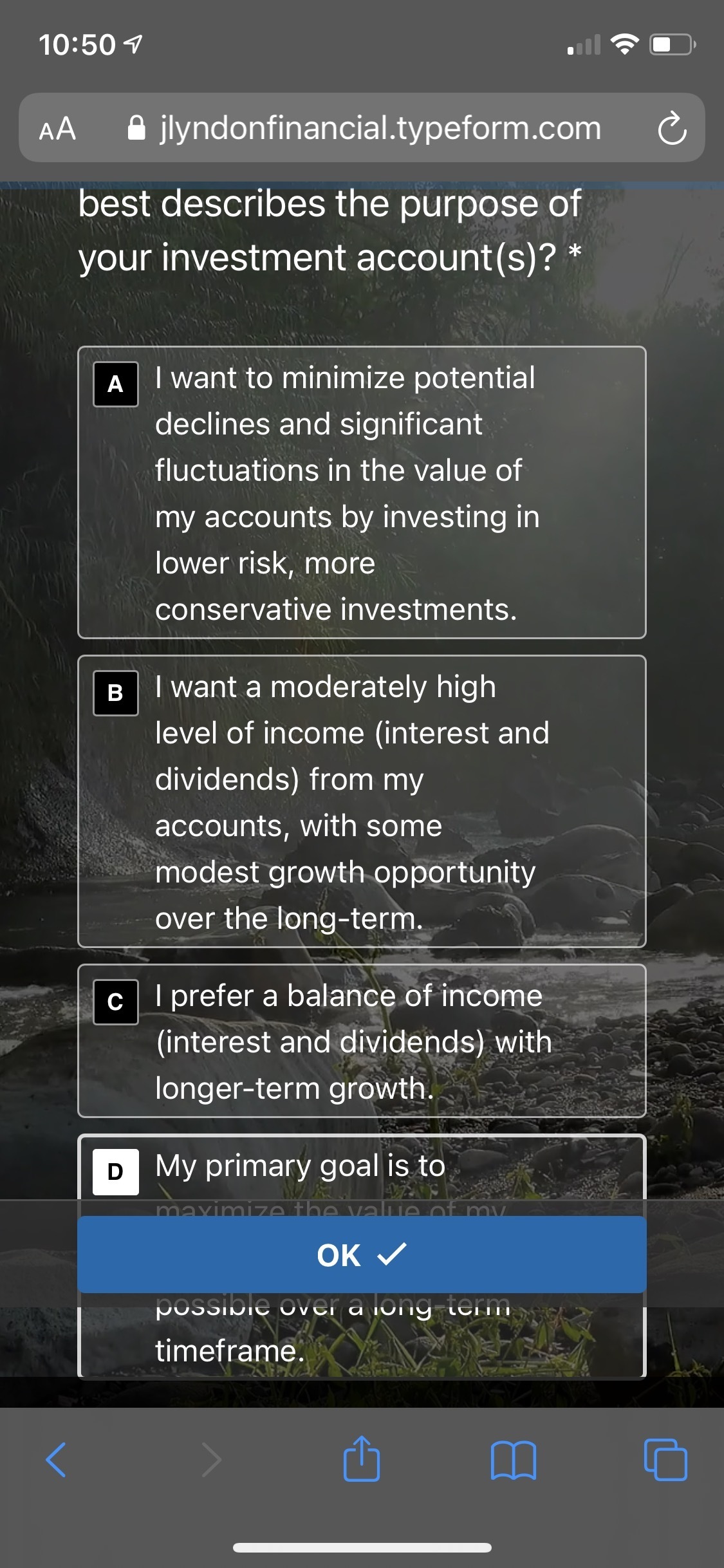
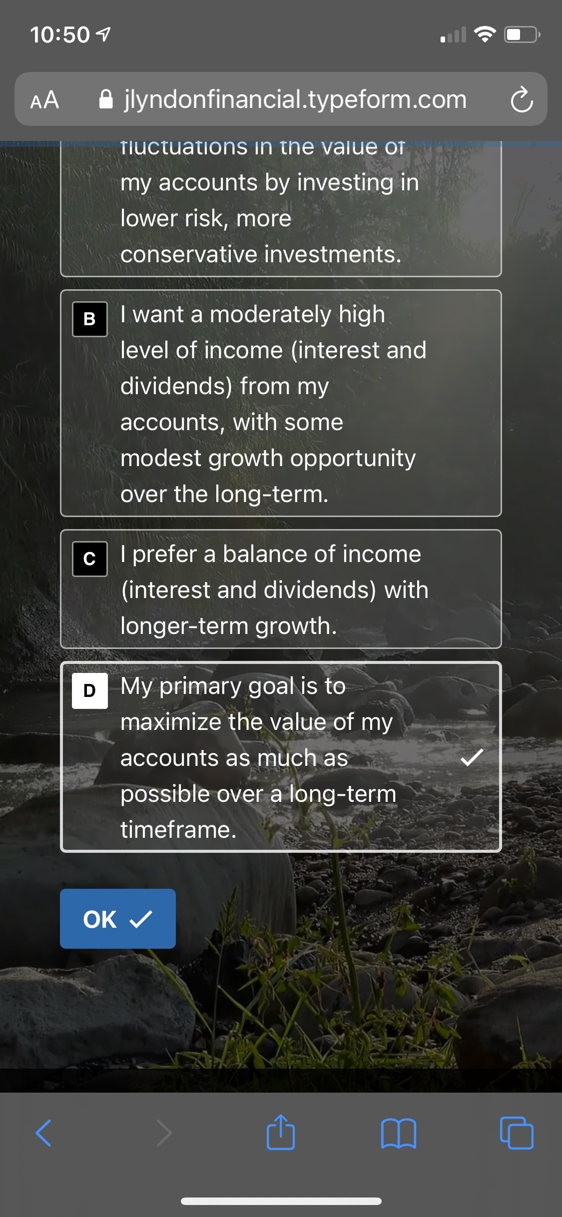
See screenshots below. I love everything about Typeform except for 2 things, which I wish could be addressed in settings:

  1. I would like to be able to use settings to turn off the floating “ok” button pictured below. It doesn’t seem like it is needed (especially since you can proceed to the next question by selecting a response without really having to touch “ok” to begin with) and I feel it is distracting.
  2. The action where you swipe up or down on the screen and you are taken the next (or previous) question is unexpected in my opinion, as I was surprised by it at first. I fear a user may accidentally skip a question and become confused, or think there is a malfunction. I’d like the ability turn this feature off as well. 

Other than these 2 minor things, the service is wonderful.

Thanks!


Jack


Hi @Jack Thank you! I noticed the same thing, and I contacted our support team to ask if this is expected behavior, which it is. Though, I know this isn’t exactly the most user-friendly behavior, so I’ve shared this feedback with our product team. 

If you have any other questions or suggestions, please let me know!


Hi @Jack Apologies for the delay on this! I can confirm that this is expected behavior, but I’ll share this feedback with our product team. If you have any other questions or suggestions, please let me know!


I found that if you minimize the question length and maybe not have a description, especially a lengthy one, that it tends to remove the ok button even if the available answers are longer.


Thanks for sharing that tip, @Jaimz Hodge ! :grinning:


Another vote for these two issues to be fixed, please! I believe the floating OK button is something to do with the way fixed positioning works in Safari (i.e. it doesn’t work very well). It would be good to remove the floating OK message until this can be implemented properly—it just looks bad at the moment.

It’s also very easy to accidentally swipe up and down on the screen. Both these issues take the polish off the UX for Typeform on mobile, which is otherwise very good.


Thanks @jaygeorge ! If we have any updates on this, we’ll post them here. :grinning:


Hi everyone! Hijacking this post. 
Has this been fixed? I even get two OK buttons now….

Only in mobile.

Cheers


Hi @malesandroPM Do you have the form embedded? If so, do you mind sending the URL so we can take a look? 


Hi @malesandroPM Do you have the form embedded? If so, do you mind sending the URL so we can take a look? 

Hello Liz, 

I have the same problem with the floating OK button - it is distracting, obscures the view of the actual questions and answers and I am afraid customers will end up skipping the question by accident. I am finding multiple threads mentioning this problem from a year ago. Has this problem been fixed and is there any option to not have this floating OK button if I don’t want it? 
I have three forms embedded and same issue on all of them on mobile. 

https://explorink.lt/mini
https://explorink.lt/standartinis
https://explorink.lt/be-rupesciu


@mathio might be able to help you out with this!


I think this is expected behavior. However the button seems to be a bit off, I there is another thread like this already. I will reach out to respective team to see if they are aware of this and ask if it is expected.


Hi, I was told by the respective team that it was just fixed. I confirmed on iPhone and the “OK” button now has correct position.


I would like to remove the floating ‘Continue’ button on statements on mobile. Right now people can just skip the statement without seeing it all which is pretty pointless. The only work around seems to be to make it a multiple choice with one ‘required’ answer of ‘Continue’, but this seem pretty silly. And besides, there is still a floating button but it just triggers the ‘Oops! Please make a selection’ error.

Why can’t it just work like desktop with no floating button?


Hi @MPP We don’t have the ability to remove this button, but I can share this feedback with the product team. 


Hello @MPP 

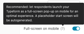
if you would like to remove the welcome screen on mobile, you can disable the full-screen on mobile option:


Or add inlineOnMobile / data-tf-inline-on-mobile option to your snippet if you are using the SDK.

However please keep in mind this might present some issues with scrolling since your respondents will be now filling out the form inline in your page. Alternative solution would be to launch the form in popup (with a button) on mobile devices.


Reply